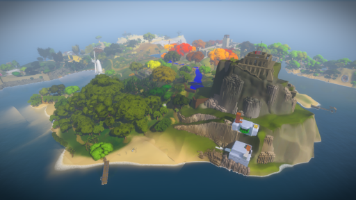
You can see Ignacio's new water in this shot (which will continue to improve, and already we have a lot of control over water visuals that we are not using yet). There's a bunch of new audio in the game. Art folks are working on revising various areas and getting them into fully playable shape. Lately I have been thinking hard about how to improve various puzzles (a couple of puzzles already just got *way* better this week), and I have also started rearranging the jungle area, which you see in the left foreground. We've had a lot of discussions with the landscape architects, and they've given us a detailed topography for the island that helps define some of the features we think will be good to have, like this river you can see to the left of the mountain (solid blue for now; it's temporary!).
Also, a couple of us have been on vacation!


I asked this on Twitter already, but this seems like a better, more direct route:
Do you feel like you’re getting really close to how the game will end up looking? (I see some aspects of this have already been answered for me!)
Looking very nice. The water especially looks very realistic and pretty, a big improvement from the last island screenshot (although that was a while ago).
Lovely. I always thought that the previous land-to-sea transition was unnatural, since it made the water seem unusually calm. Really glad to see that it looks much more believable now. Keep up the good work!
Also, I’m noticing some unusual jagged lines on the water on the left, and on the southern shore. Perhaps you could look into this, and polish it up?