The Witness contains a mixture of indoor and outdoor scenes, but much of the game takes place outdoors with a very long view distance (you can see the entire island at once if you have a good vantage point). So I wanted to implement a shadow system that would work robustly, provide high visual quality, and allow the player to see everything at once. I have some experience with shadow systems of this type, but the last one I designed was for computers and graphics cards circa 2004, so I was interested to see how much more would be possible today.
We've implemented such a modern shadow map system for The Witness. In the process, we've made some improvements to shadow mapping algorithms beyond anything we've seen published, so we are going to detail the improvements here. Also, our shadow map system is still being improved, so I'll talk about what we have yet to try and why we think it's a good idea.
Before we get to those details, though, I'd like to establish some context so that the motivation for these design decisions is clearly explained.
The Literature
I have a somewhat cynical attitude toward graphics research literature: most of it describes techniques that don't generally work, but the authors of the papers do the best they can to "sell" the technique to you anyway (using cherry-picked examples, glossing over or completely ignoring failure cases that would be obvious to anyone who understands the algorithm, etc). As the reader, eventually you come to understand all the problems, but not after investing a lot of your time and energy (possibly months) implementing and understanding an algorithm that behaves so poorly that you never would have bothered if you had known the truth from the outset.
I've had this experience many times, with many different techniques. Shadow maps, though, have been one of the big ones. There are many published shadow map techniques that simply don't work well enough to be taken seriously. And often when I've heard someone say "so-and-so shadow technique is good," it usually turns out they haven't tried it themselves, so it's just hearsay, or else that person has low quality standards.
So I'd like to put forth the statement that I have high quality standards and will only endorse things that have been found to robustly function; I will be open and honest about the degree to which things don't work, and what the specific problems are. In an ideal world this would not be necessary to say, but the situation in the literature today makes it otherwise.
Quality Goals; Previous System
Many shadow map schemes have been developed that try to maximize the effective resolution of shadows in the scene by performing transformations that are heavily view-dependent. An extreme example of this is Perspective Shadow Maps. I have learned through experience not to use these techniques. They cause shadows to swim and flicker in annoying ways, and many of the algorithms break down severely as the player approaches certain viewing angles.
For the 2004 system, I took as a core design goal that shadows should appear rock-solid on nonmoving objects, regardless of any viewpoint motion. The clearest way to achieve this was to center the shadow map on the viewpoint at all times, never letting the shadow map scale or rotate. Because a single shadow map cannot cover the world at high resolution within memory and fill constraints, I used a scheme where 4 or more shadow maps of increasing worldspace size were centered on the viewpoint like square doughnuts. In order to prevent crawling or shimmering, one just ensures that shadow map worldspace positions are snapped to integer multiples of their texel size. (A family of related techniques, but which don't necessarily center the maps on the viewpoint, soon came into more-common use and took on the moniker Cascaded Shadow Maps.)
On fixed-function pipeline hardware, this scheme was never quite satisfying (I had to use clip planes to render the scene in many slices, and there were small 1-pixel artifacts due to the resulting imprecision; rendering all the slices was a bit slow). Modern hardware is able to do this kind of thing much better. Also, this scheme wastes a large amount of shadow map memory, because with all the shadow maps centered on the viewpoint, most of the map texels are going to be out of view at any given time.
Despite the drawbacks, the visual stability of this technique, and its ability to reach across the entire game world, were extremely appealing to me. Having seen how nicely shadow mapping could behave in practice, this visual stability became a very-high-priority goal in my mind for any future shadow systems.
So, going into this new system, the goals were (listed in approximate order of importance):
- High performance
- Complete stability under camera motion
- Long view distance
- Visuals can be controlled to suit the style of the game
- Efficient use of texture memory
The New System
I started working on the new system by looking at the 2004 system and trying to make it more memory-efficient. Most likely this would involve moving the shadow maps around in world space, but it wasn't initially clear to me how to do this without introducing problems. Ignacio pointed me at Michal Valient's article "Stable Rendering of Cascaded Shadow Maps" in ShaderX 6, which was exactly what I wanted. Valient computes bounding spheres around the slices of the view frustum that tell him how much he can move the shadow maps in world space without introducing gaps.
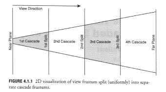
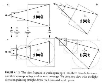
To illustrate, here are a couple of figures reproduced from his article. I don't want to unduly step on anyone's copyright, so if you are interested in cutting-edge shadow map techniques, buy ShaderX 6! (Click for full size.)
So basically, you take the a frustum slice in worldspace, ensure that it is completely enclosed in a sphere, and then ensure that the sphere is completely enclosed in a square cylinder; the square is your shadow map.
You can render multiple frustum slices for multiple shadow maps, so long as the bounding spheres overlap enough to cover the whole frustum when put together (see 4.1.2 c and d).
The reason they are spheres is: because the shadow map is never allowed to change size (we voluntarily imposed that constraint in order to get solid shadows!), then we need to find a shape that conservatively encloses any possible orientation that a frustum slice could occupy as the camera rotates in space. That's a sphere. Then we make sure that our shadow map covers that entire sphere, and we have then guaranteed that every point in the view frustum is covered by a valid shadow map texel.
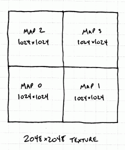
On top of this, Valient suggests the very helpful optimization of packing all your shadow maps into one atlas texture, so that when it's time to render the scene, you can draw all your shadowed objects in one pass without having to sample multiple textures; you just figure out which frustum slice each pixel lands in, then use that information to determine the offset into the atlas, add that offset to your texture coordinates, and sample the texture. This works great. Valient suggests a 2x2 arrangement of textures, as this is convenient on a wide variety of hardware, for example, GPUs that only support power-of-two textures. So if a single shadow map would be 1024x1024, then you can create a 2048x2048 texture map that contains 4 shadow maps packed in a 2x2 array:
So my first shot at a new system was basically a reimplementation of everything Valient describes. It didn't take too long, and when it was done, I was very happy with it -- it was clearly much better than the 2004 system.
But...
Memory Usage
This technique is still a memory hog. The image stability constraints, which result in us wrapping the frustum slice in a sphere and then the sphere in a box, add margins of unused and barely-used texture space at each step. Looking at Figure 4.1.2, you can see that a frustum slice only occupies about 50% or 60% of the area of the square that represents your shadow texture. This implies that half the square is wasted. However, the actual situation is worse than this, because the diagram is misleading.
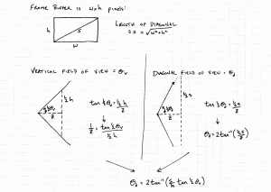
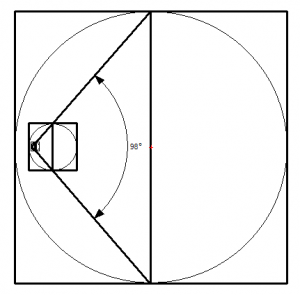
The problem is that the view frustum represented in the diagram is much narrower than the view frustum used in an actual game, and if you re-draw the diagram in realistic proportions, it looks very different. For an accurate 2D diagram, you are finding a circle that encloses the widest part of your view frustum, which is the 2D trapezoid you get by cutting your frustum in half diagonally (Valient discusses this in his paper as well). Suppose your game is rendering at a 16:9 aspect ratio, and your field of view is 90 degrees horizontally (this is what we use for The Witness currently.) The vertical field of view is then going to be about 59 degrees, and the diagonal field of view will be about 98 degrees (click on image below for explanation).
The frustum slice in Valient's diagram is only about 30 degrees, a huge difference! So if we have a 98 degree frustum slice, and inscribe that in a circle, and inscribe that circle in a square, what does that look like? Something like this:
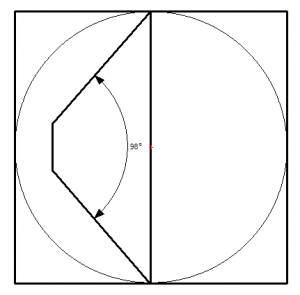
Recall that the square is your shadow map texture and the innermost trapezoid is your frustum slice (the texels of your texture that may potentially be used). It covers only a small area of that square -- and there's no way to make it bigger! The reason is that for wide frusta like this, the diagonal at the far plane is so long that it dominates the bounding sphere computation, and so the center of the circle has to land on that diagonal so that its diameter can be just barely large enough to enclose it. (In The Witness, our frustum slices are not proportional, and the way we divided them up, this isn't exactly true for the first 2 shadow maps -- but it is very close to true). The fact that the circle is centered on the far plane means that automatically half the map is wasted at this orientation -- but the wide angle ensures that much of the other half is wasted too!
You can rotate the view frustum to other orientations and make it look like you are covering more of the shadow map... for example, if you orient the frustum so that the view vector is going straight down into the page, then the frustum's projection onto the paper will be a rectangle, and it will appear to cover much more of the square. But then you have to keep in mind that some of this coverage is worth a lot more than other coverage in terms of impact on the scene: think about how much space is covered by the texels toward the middle of the frustum projection, versus how much is covered toward the edges (almost none!)
If I add two more frustum slices, so that the total is 3 slices as in 4.1.2, it looks like this:
That innermost shadow map is just a tiny smudge (now you know why Valient chose a narrow field of view -- for clarity of his figures!) But notice what else is going on: each shadow map is fully contained within the next-larger shadow map, as with the concentric-square-doughnut system from 2004! Valient's scheme is better since it gives you more view distance (the squares are not concentric) -- but it can't give you nearly as much view distance as it would like, due to the wide angle of the frustum.
For Next Time
So, whereas on one level I was very happy with this shadow system's performance and visual quality, it still seemed somewhat wasteful in terms of memory usage. Next time I'll talk about how we addressed that problem. Subsequent postings after that will talk about issues like softening the shadow border, blending between slices, and various other implementation tricks.
To be continued.


This is awesome, its cool to see developers talk about the technologies behind their games. It inspires people to look into a career in game development and it helps beginners get a grasp of what problems they may encounter and how to go about solving them. I look forward reading more about this stuff.
To say that I’d understood everything in this article would be a huge exaggeration. But, nonetheless, I find it hugely interesting for the same reason I read EVERY of Richard Leadbetter’s tech articles: I simply want to know how the clock ticks behind the cover.
Keep them coming.
Very nice article, this is nearly the level of technical detail I like to see in a development blog. I hope the next article will really dive into the nuts and bolts of implementation.
I have a question regarding following the developer blogs.
I am looking forward to think game more than any other game that has ever come out. With that being said, when I play The Witness for the first time, I would like it all to feel fresh and new, I am afraid however that if I follow this blog to closely it wont feel fresh the first time I play it. I am worried I will just start to play through what I have already seen via blogs.
Do you think that I don’t have anything to worry about, and the experience wont be hampered by that much of a degree?
I do realize that following the blog will take some of it away, but if it isn’t by much I will continue to follow you blog very closely.
Thank you for your time.
It is your call! I would guess that if you follow this blog from now until the game’s release, that is a *lot* of information, and there isn’t any way that the game will feel totally fresh.
However, I am going to try to stay away from spoilers and that kind of thing.
Thanks Jonathan, I’ve been using cascading shadows for years and never knew how they were made! Very clear article, concise and complete.
For those who want more of these “open development” blogs, you might be interested in Wolfire’s blog that has been going on for over a year… and btw Tyler, they discussed the dilemma of spoiling the freshness just a few days ago! http://blog.wolfire.com/2010/03/The-dilemma-of-open-development-and-polish
i just finished Braid like 3 hours ago and it is the best game ever. and yep the princes is the atomic bomb but also a girl. i think it uses the human relationship as a simbol for… well alot of stuff, it could be interpret as lot of things because the end is very open ended so people can draw conclusions that are very difirent, but there is always the interpretation of the creator and i think that is the most important one.
mr. Bowl you must feel realy good that Braid has done so much in so little time, imagine how it will be interprept in the future… i didn’t use a guide at all like you said and i’m glad i didn’t… ohh and ofcourse i will get the Witness, i hope it comes to PSN. its looking really mystirius and that technique you talk about looks as if a human being would look at the real world, i love when developers share what goes into their game
<>
I’m happy to hear that. As I always had disappointing result with my own shadow map.
I’m using parallel split shadow map. It’s working but I still have few artifact here and there.
So I’m waiting impatiently for the second part.
Question : how often do you update your shadow map with the movement of your camera ? What kind of bias do you use ?
The shadow maps are currently updated every frame.
There’s a Z bias in the shadow map depth test that is proportional to that particular shadow map’s texel size. I think it is 0.7 of a texel or thereabouts. Currently we render shadows using the parts of geometry that are front-facing to the light source, so that equates to the front face’s position plus 0.7 of a texel in Z.
Johan Andersson at DICE has made a presentation of how the shadow map utilization was increased in their frostbite engine:
http://www.slideshare.net/repii/02-g-d-c09-shadow-and-decals-frostbite-final3flat
What size is your monitor Jon? It looks 4:3.
It’s a 16:10 monitor. 2560×1600.
So Jon, is the engine for this game being written from the ground up or is it based on an existing engine? Really interesting entry btw.
It’s really good to see this kind of information up. I dont understand anything written in this entry but knowing that your taking so much care with the development of your next game is enough assurance for me. I loved how Braid make me think. And hearing about the creation of your next game makes me excited. Keep it up! I know this game will change the way I play games the same way Braid did!
The way we arrange our bounding spheres is that we don’t give you a splitting plane to specify them, the only parameters we give the artists is the radius of each bounding sphere. Then we arrange each of them so that their “back” touches the far intersection of the previous one with the frustum. This way you get minimal overlap between bounding spheres, while not having any gaps between them.
The important realisation was that we don’t really care that much about having a straight splitting plane involved here at all, so the important thing isn’t to match a sphere to splitting plane, the important thing is to push all of our spheres forward as much as possible while not leaving any gaps. So the first sphere is pushed forward as much as possible while still containing the near plane. Then we compute the far intersection of this sphere with the frustum, and the second sphere is pushed forward as mush as possible while still containing that intersection, and so on.
In the shader we just check the shadow-space coordinate for each cascade to see if we need to move to the next one, so you always choose the higher res map when there’s overlap.
Sebastian, that’s an interesting way to think about it that obviously works. It might introduce some further dependency on camera orientation, but that already exists in the Valient scheme if one uses view-depth as the way to decide which shadow map to use (as suggested in the GPG6 article).
Did you guys find a big win doing it this way?
In terms of checking the coordinates… how do you do that efficiently? You need to check if either u or v is outside of either 0 or 1, right? I guess if you rotate the global shadow map depending on which way the camera is facing, you might be able to just test against 1. But that may interfere with the other optimization that I am going to post about next…
Hmm, one could actually just test against the sphere instead of testing texture coordinates. I wonder if that would be faster.
Jonathan, the big win is that we get pretty good shadow map resolution, the downside is that your transition regions are circular (in principle, for any given view it’s obviously a box since the shadow space will clamp to the sphere) so you could get lower res shadows around the edges of the screen compare to the centre for objects at the same distance but to be honest that’s actually pretty awesome because important stuff generally happens near the centre of the frustum so you’d want to skew resolution to that area, and again for any given view you typically get the shadow frustum for the higher res cascade cover a large part of the “low res” region in the overlapping area anyway so it’s not generally a problem except for very specific views (this advantage would go away if you just test the bounding sphere).
For testing the coordinates I just transform into the space of the first shadow so that the x,y coordinates are in -1,1 range, and the z is in 0,1, then I take the abs (free) which pushes all valid coordinates to the 0,1 range, any invalid coordinate would now be >1, and then I do max4 (Xbox 360) to get the biggest one which avoids checking each of them, if this is greater than 1, then we’re outside the frustum.
Currently I just transform the coordinate again for the second cascade (we’re pretty fetch bound so no need to get fancy with the ALU cycles at the moment), but in since your cascades are all aligned the differences between coordinates in one of them to the next is just a scale and offset, so a single mad would actually do to move to the next one.
Great read and is helping me a lot. I’ve implemented a PSSM, but I find the shimmering when I move or look around annoying. This is exactly what I needed to move in the right direction.
Please keep posting :)
Very nice article, there are too few of these – when you’re new to the subject you need to do a lot of digging first to find something this clear :)
I was wondering how you’d handle the stability issues with a dynamic light say a day-night cycle? I couldn’t find anything on that subject for now.
We have a CSM implementation for our outdoor scenes with dynamic lighting and the best solution I could find around the issue was to only update the shadow casting light direction every 15 seconds or so. This introduced highly visible pops in the shadows of course, but it’s a lot better than the constant shimmering from the moving light.
In this game, we don’t have a dynamic day cycle, so I just don’t worry about it. I have noticed that for example Assassin’s Creed 2 does what you are talking about (with the accompanying pops). If you are willing to burn some memory and bandwidth, then you can of course just keep the most recent two sets of shadow maps around and interpolate between them to get rid of those pops. I think that would feel pretty stable.
Can anyone here recommend me some beginner’s literature (preferably a book) about this topic? Looks really interesting, but right now I only get parts of it…
Looking at the pictures I realized something. Perspective Shadow Maps attempt to keep its buffers tight, by sacrificing stability, but you could use their same concept of a perspective-distorted projection without necessarely ajusting that distortion dynamically. With that said, you could settle for the optimal projection based on the same frustum slice inside sphere inside square concept of Valient, and tighten you perspective projection around the worst case scenario possible camera frustra (the 98º trapezoid in your pictures) So you get the best shadow map utilization, and stability. Maybe that’s exaclty our solution? Maybe I’m missing some limitation that does not make my suggestion practical? The whole thing is actually kind of hard to picture haha.