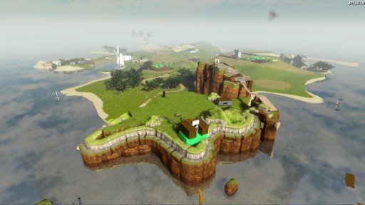
Here's your Island Snapshot for the end of January. Recently, we've been mostly working on things you can't see, but you may notice some subtler differences in terms of buildings / structures.
The most obvious difference from the previous shot is the thicker atmosphere. Ignacio changed the fog model; the fact that we have a bit more fog, combined with the art style we've converged on, should help us do high-quality LOD handling for distant objects.
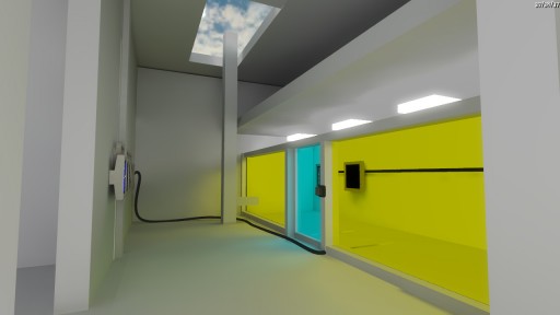
Your bonus picture for today is part of an indoor complex that I am very happy with. This room is all white with a bit of colored glass. Note the lovely lightmapping, even on such slapped-together geometry:


That interior looks a very Mirror’s Edge-esque. White with a splash of colour. Love.
I love these little glimpses into your games. I’m getting a real Myst vibe here, but maybe that’s just me. I can’t wait to play it.
it looks awesome!!!!
Yes indeed, that bottom shot is looking gorgeous. Would you call that representative of the final look of the game or are we still talking placeholders?
Very Mirror’s Edge-esque indeed. Very easy on the eyes. I’m eagerly awaiting the game itself but I got to admit that it’s starting to look absolutely gorgeous.
I like the fog, it’s one of those “effects” that make a scene easier on the eyes by adding some cohesion, just like G.I. can do. However, with the cool grey fog, it does seem like a bit of a departure from the original warm colorschemes that you posted earlier in the concept arts (http://the-witness.net/news/wp-content/gallery/concepts-1/tw_color_palette.jpg), but perhaps that’s just because such a great portion of the screenshot is made up of the water’s surface.
The fog thing also reminds me of a technique that I’ve always liked in WoW, where objects don’t just fade out into the fog, but instead they slowly blend into a silhouette. ( http://goo.gl/KqOLU )
That lighting is absolutely amazing! It looks like a render, not something that could be achieved in a real-time environment.
forget the myst references! this is like Mirror’s Edge kind of lights and colors and buildings! it looks super cool… Futuristic
The second picture is brilliant!
: O
The engine will have to resolve the AA samples post tone-mapping with such high-contrast objects.
The geometry is all still placeholders. I built that bottom scene over the course of maybe an hour just by making blocks and dragging them around. Eventually the room will be re-architected and remodeled with production geometry.
The fog probably is a bit cooler in color than we will eventually want. We’ll tune that later. I also want to see if we can make the fog a simple function of worldspace coordinates, so that it feels denser out near the shores.
I think I can see The Others’ village in the back.
I’m curious, I get the impression from some of the other posts that there’s some massive twist at a late point in the game. Will this be one of those games that require completely abstaining from reviews/spoilers/etc to get the full effect, or will it be more along the lines of Braid (in that there’s a definite twist at the end that makes you reevaluate what has come before, but not so much that it’s integral to the gameplay itself)?
Can’t wait for the Game Jonathan. Huge fan of Braid and am impressed with how you have gone for something completely different from it. I loved the look of Mirrors Edge environments and can clearly see that i’m going to have a ball walking around this Island, whether it be to the next puzzle or just aimlessly wandering.
Oh and in regards to people who are thinking the game is just gonna be about solving blue mazes. I have faith and i’m positive all your true fans do aswell, which accounts to over thousands of people.
PS: Even if the game was just about solving blue mazes, i’d still love it coz i love mazes :P
Everyones saying Mirrors Edge but Im not convinced, Im actually getting a different feel from it (Can’t think of any example thats felt similar to this so Ill describe it.) but its alot softer and more harmless, mirrors edge had much less (In my opinion,) quality of light and it always felt like there was too much contrast which made me slightly on edge (honestly no pun intended) which Im sure was the point but in this the soft colored light coming from those tinted windows ties the scene and is absolutely stunning, as was said above is looks like a render in POV Ray or some other high quality rendering product :) Keep it up, I’ll pre-order the day it’s available.
> I also want to see if we can make the fog a simple function of worldspace coordinates, so that it feels denser out near the shores.
Jonathan, why not make a function of coordinate who could change during the time ? By this way, the fog would be more thick or thin by playtime. It would be more realistic than a constant quantity of fog according the coordinates.
Arnaud.
I’m one of the Myst guys and I love the Myst-like look (hoping not to offend Jonathan feelings ;-)), however the look, spirit and technique is of course way beyond the Myst era. I’m interested and looking forward to see what you’re coming up with. I also have the faith, the game will be something to remember, maybe mainly because of the graphics but maybe also because of the environmental feeling and whatnot… can’t wait to play and see the game as a whole… but don’t hurry! You gotta do what you gotta do! ;-) We’ll stay waiting patiently and meanwhile read that blog. This is already a new “game experience” for me! :-)
Nice. I’ve been following this blog for a while (well sine i finished with Braid) and I must say The Witness is very promising.
Can You tell how close it is game being done? Can’t wait :)
Jonathan, this is the first dev blog I’m following, and I must say that I’m very impressed with the steady updates. It’s great to see the work in progress. I loved Braid, and I’m looking forward to this game. Keep up the great work.
Arnaud: Because this game is not about trying to be as realistic as possible, and also because ever extra bit of complexity makes things slower and more complicated. You have to pick what you really want and think is important in designing something like this, and having fog that varies over time is not important to the game we are making.
I see what you mean about the lightmapping; the indirect lighting is absolutely fantastic in that shot, esp. the bit of interreflection on the left side of the rear wall. I see a slightly sharper shadow on the floor near the left wall – is that the shadow of the bar between the lights and the colored panes, or what?
Also, out of curiosity, how are the ‘power cables’ laid out? Do you spline those yourself, do they come in prebuilt shapes, or have you got some sort of relaxation scheme to get them laid out naturally?
That shadow is of the column it’s next to. The lights on the ceiling are pretty bright.
Right now the power cables are just Catmull-Rom splines with waypoints set by hand. I might add in something to auto-adjust them to the surface of the ground or floor, which may save some work when we are trying to make things precise.
wait… i see no indoor complex that big on the island snap shot, maybe is just that the buildings look very little when perhaps they are actually very big? or… is this building complex underground? b/c i remember you saying something about under ground tunnels divided by colors or something like that.
and what is the subtle change you did on structures they don’t look much different from this far….
if you are hiding more buildings underground or spaces on secret parts of the island that would be very weird. : P
In the shot above, it’s the white building you can sort-of make out behind the windmill. Since then it’s been moved across the island and you’ll see its location much more obviously in the next shot.
please please please! take picture or video and post them here… or try doing some sort of analysis of what happened… and it would be really cool if you explained all you did in the world and how people reacted… a cool idea is to put a camera in the play-tester’s monitor and record their face while they play so that when that “Aha!” moment happens you have it and can use it to explain or talk about the game, since you have explain that this will be difficult and happens in people’s head. you should also talk to Pinchbeck for help. b/c he did an exploration game set in an uninhabited island somewhat like The Witness. good luck in the event and getting the island ready for the testers. don’t forget: take pictures!
justin, show some restraint.
is that a real time light bounce ? it looks like Purelight or Id’s radiosity simulation lightmapping… is it pre-baked though ?
Still don’t understand anything of this game. Juste love it! Go on Jo ;)
It’s Baked.
lighting looks wonderful in the second shot. pretty ridiculous how excited i am to play this. still, don’t rush.
Pingback: Island Update | The Witness
I am in utter awe at the last screenshot. It’s very reminiscent of Portal; very dystopia-like. I love the cyan and yellow windows. I am very, very, very much looking forward to this. Braid is in my top-three favourite games of all time and I still play it to this day, with particular emphasis on the ending. Braid nearly made me cry and run down the road screaming everything I was feeling at that particular moment. Thanks Jonathan and team!
Gary
xx
Wow, I can’t wait for this game. I am wearing Braid out. I haven’t visited the witness blog lately, any update on the approximate release date of the witness?