


We were kicking around ideas of what a Witness poster would look like if we were to make one. We eventually came up with one that we really liked, and we'll release that at some point in the future. But in the meantime we thought it would be nice to show some of the runner-up concepts.
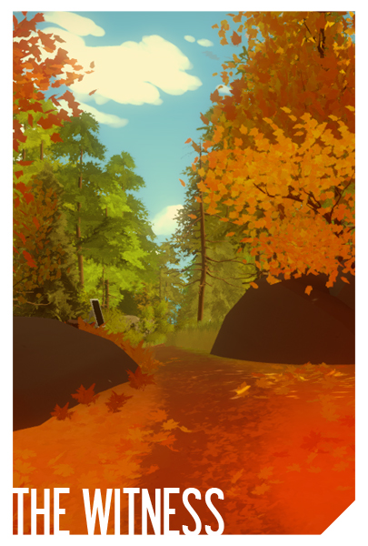

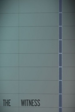
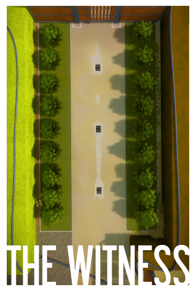
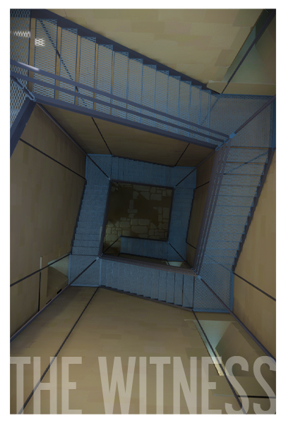
Feel free to use these as desktop images or whatever. Unfortunately we didn't mock these up at high resolution; what you see is all there is!
Woah,
The top one is nice, bottom one is stunning. I also am drawn to the stairwell one – too.
Those are my picks!
I’ve been following this blog for about a year now, and I just want to say that these look amazing! Very excited to see what else will be revealed in the next few months.
Really like the staggered staircase with grass.
The first one is AWESOME!
The second one is pretty cool.
The third one is a bit… meh…
The fourth one, I’m really not a fan of.
The fifth one is neat! Great use of colours.
The sixth one reminds me very much of the Indie Game: The Movie cover/poster.
The final one is BEAUTIFUL, and I’m glad it doesn’t have ‘The Witness’ written on it. The little screen feels a tad misplaced, but it would make a perfect wall hanging.
—
Thoughts, people? :].
xx
This is meaningless, but a strange coincidence: today I actually thought I’d love to have a The Witness poster (and it was a really random thought because I hadn’t read about it or anything). I was about to send you an email to suggest it but then I disregarded the idea as stupid… :o
I like the second to last one. Might be cool to take it one step further and make the title a part of the puzzle itself.
The second from the bottom one is the clear winner for me. Keeps it simple, and has that air of mystery about it that the game seems to exude. That puzzle design is very recognisable for me as ‘The Witness’. Plus, as beautiful as the in-game graphics are, I’ve never really like it when essentially screenshots are used as promotional material, with rare exceptions. Plus it has that affect of people who know the game ‘get it’ and makes them feel exclusive and part of a ‘club’ as it were; people who don’t understand the reference I think will have their curiosity piqued enough that they might give it a Googling.
It’s hard for my eyes to understand what’s what in the first one. They see it, but they don’t want to focus on individual details. There’s a certain beauty about that. Just colors.
They’re great.
I’d probably buy Luis 10 or Luis 12.
Shannon 1 needs text, in my opinion, but it is a stunning image.
The second from the bottom is highly evocative of the Indie Game: The Movie poster (perhaps a callback of sorts?) due to the color scheme and font, but to be honest it doesn’t feel like the font goes too well with the other ones, in my opinion of course! The third one works actually, and the one with the text spread out on the ground is neat but think it would be better with the font you used to write “The Witness” at the end of the February trailer. But regardless, nice work.
My vote goes to Luis 10 and Luis 03
I like how the last one contains a beautiful, sunny part of the island as well as a hint to the game’s main mechanic. You could try overlaying it with the text of Luis 3. (Or text as clouds? Or text as flowers?)
Also, I’m requesting that last one in a high resolution! :3
I love the 3rd one (Luis_02) Why don’t you get David Hellman to draw one just like in Braid?
These are all very cool and somehow Sci-fi looking or Inception like movie posters.
I wondered which one you guys ended up pick (I’m glad you didn’t show the best one)
Will it be more concrete (A panel or maze in game puzzle) or be more abstract (Like Braid’s
Sand castle poster)
bty I don’t even know what Luis_02 is it just looks awesome, I’m guessing is a ceiling/roof or wall…
There seems to be an strong and aware emphasis on trying very hard to be iconic. To have places that when you see them, scream “The Witness.” Being iconic and recognizable is good but what if you put a spoiler, secret or Easter egg in plain sight that none understands until after beating the game. That would be an interesting poster.
This is what my desktop looks like now.
I like it!
Does this mean the game’s nearing completion? What is the puzzle count?
(Obviously, if we don’t know the release date that means that there isn’t one for us to know – just asking how work is going, since this blog’s been silent for a while.)
The second one. Feels divine.
A witness might be watching me from above while I’m wandering alone on that “uninhabitated island”. Who could it be?
I really like the second one down – something about the juxtaposition of the organic beauty of the natural world and the simple geometry of the (presumably) man-made steps speaks to me of some deeper themes, though I can’t really express what those are :)
Loving the 2nd one and the 6th one. Actually very neat.
I like the minimalist one the most, but I think the second one is very nice as well. It would also be perfect as a box cover.
I doubt there will be a box though :P
These are all great and evocative of different things about the game (or at least my constrained perception of it). I’m partial to Luis_10 and Luis_12 but if these are the runner-ups I can’t wait to see the one you went with.
Thank you so much for sharing those artworks, they are splendid!
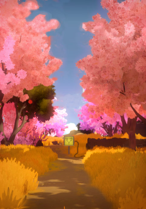
i like the top one best; it highlights the autumn trees, the searching path and also the colours are very welcoming
these look like postmarks and the font used in old times , well is this a correct observation i’m having !?
Very pretty! My favorite is the second one down; I really like how the title is incorporated into the environment. The lines of the steps also remind me of the line puzzles, which seems very appropriate for this game.
How would these be used? I mean, I assume you won’t be putting up posters in Gamestop (maybe I’m wrong?). If you’re just selling them, I might be interested. I’ll have to play the game first, though! Can’t wait guys, I hope we’ll hear a release date soon.
the second one seems a bit distant and removed with the overhead shot, whilst the first is more involved and engaging because of its player-perspective
Ah! Really nice to see such a warm feedback from the community.
When I proposed the minimalism one I didn’t think it would be that well received.
So here it is in higher res:
https://www.dropbox.com/s/hz3o5stn76aa0mg/Luis_14.jpg
and a desktop background version:
https://www.dropbox.com/s/oa7f00anew34aj4/Luis_14_Screensaver.jpg
Thank you soo much! You’re awesome!
02 and 03 are the coolest! May I ask for a Hi Res of luis_o2 (the grey wall/cealing?)
Please post some more wallpapers!
I feel like the most effective art is the simplest art. I really love that line paper design because the title is highly visible and immediately eye-catching.
It might also be good to include something in the art which is central to the game, but not revealing in any way.
The first one really captures the ‘what’s around that corner? I bet it’s pleasant’ feeling.
My wallpaper has been the opening title of Braid for a long time, I look forward to updating it!
http://th07.deviantart.net/fs46/PRE/f/2009/170/b/9/Braid_Wallpaper_by_Liquos.jpg
The first 2 Luis 04 and Luis 10 look more professional to me, are the most vibrant of color while also being subdued. I love how the lettering blends in with Luis 10. I like the staircase but there’s something about the how the stairs are lined up with the edge that’s bugging me out like some of it is slightly cut off. Maybe a slightly higher shot would be perfect. I also love posters with no lettering at all (the last one) but something about it isn’t cinematic enough, like better framing might make a huge difference, or maybe it’s because it seems like a very straight on angle but the screen isn’t centered. Well, I know these aren’t what you were going with anyway, but this is definitely cool! Thanks for sharing! Awesome work as always!
If I may express my humble opinion as a graphic designer, I think the designs look a bit lazy, and while formally well constructed, they don’t seem to be doing a very good job at conveying a powerful message.
Eagerly following this project. Cheers.
i feel like luis 03 has some really deep meaning that i hope i will eventually understand….or maybe it’s just the solution to the first puzzle :-) either way i like it.
my fav is luis 10. it just looks great, and i love the way one set of terraces is sunken and one is raised.
I like the blue one !
Can I make and sell Witness T-shirts?
If you make them, I’ll buy em’
If the runners-up are this good, I can’t wait to see the final poster!
I think they look great. Autumn leaves, spiral staircase and “Indie Game: The Movie” designs are the best.
It might be tough to do, but I thought you might be able to do a figure/ground design like the “Star Trek: Into Darkness” poster where if you squint your eyes you can see the Star Trek logo.
Something that would reward careful observation. Just like the game.
Can’t wait to see what you come up with.
Very nice. The second poster is now my new ipad wallpaper. Beautiful design i cant wait for this game!
I get the feeling that when you revel the real poster, people will say “oh i liked the other one better”.
It just seems like the kind of thing people would do.
Everyone always does that, yeah. It’s the Internet.
Thanks for showing us all the others anyway. It makes us feel warm and cozy inside. Or maybe that’s the burritos I just ate. O.o
Ah, come on… the Internet has become quite a good mirror of real life. Can’t you just feel how the reaction would probably be the same if you took 100 people in the offline world and did a study with them?
I find the trees very beautiful in this game, so I like the first one, with the ‘what’s behind’ feeling, and the last one, with the ‘what is this’ feeling and the fact that it ‘speaks’ both about exploration and puzzle part of the game. I like the second one too, full of mysteries. I would like to see how it looks with the same painted title idea but surrounding by ‘pink autumn trees’…
Love the grassy pyramids. I imagine that someone standing on the ground couldn’t see the letters until they climbed the pyramids.
I used to have a photo of my first-born son on my phone.
Now I have this.
The second one seems to be out of the ordinary in these wallpapers and it seems the best because of that. :)
The blue one would make for a great t-shirt!
I find the first one to be very beautiful but I’m assuming it wasn’t chosen because it doesn’t look like it really would reflect the game (based on what little I know :P).
That’s the one I was going to make. I want to do a slightly different maze, however. Jonathan, can I make some?
I’m serious! If you do it I’ll buy it! Just go ahead and do it! lol
We’d need them to be a higher resolution and at various landscape mode dimensions to use them as wallpaper for a desktop. I guess you meant using them as wellpaper on the phone or tablet, but sadly I have neither.
The 3rd one is missing a link to the bigger version.
Hi, first of all I want to state my gratitude to you because you have created Braid. It really hit me hard with music, puzzles, graphics and backgrounds. I am 22 and Braid is my favourite game in the world even thouhg it’s been 3 years. I am from Turkey and looking forward to get your new projects.
For posters, you should choose first, second or last one. In fact second is my favourite beacuse it makes me feel excited, curious to purchase the game. I don’t know what do you want to leave impression among people but if you are looking for these, I strongly recommend.
At the and I’ve watched Indie Game: The Movie. You were saying like people didn’t understand you they only played and said “look, how am I going back, bending time “ahahah” like mario dude..”. I am not like them I really appreciate your work and I am glad that I could have a chance to play Braid. Thanks for creating it.
I hope my feedback helps you. I know you don’t need but If you need anything to be done in Turkey, I gladly help you, have a nice day.
Loving the look of this game, loved Braid, just very excited.
I’ve been really hoping I could convince any developers who may come across this to make banners I could use as a cover photo; cover photos are 851 pixels wide and 315 pixels tall, and these are absolutely gorgeous, but of course they’re quite Vertical