


What’s up, internet? I’m Eric - one of the artists working on The Witness. I figured what better way to celebrate more than two years on the project than by making my very first post on the development blog! (plus, Luis and Orsi hassled me!!!) So here goes:
In the olden days of The Witness art development, our visual “style” for the game hadn't really coalesced yet. Or, to be more accurate, we knew what our objectives were (from a purely theoretical, gameplay-based perspective) but we hadn't really grasped what the ramifications would be in terms of our production process.
For instance, on an early attempt at adding a rough-stone wall, I approached it like most modern game artists would: using the full spectrum of art tools and tricks... normal mapping, edge-distress, enhanced details, etc..
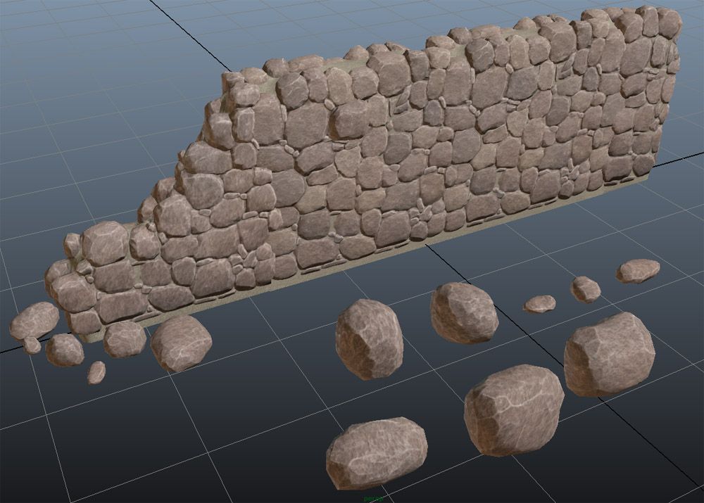
But the problem with this approach is that it’s sort of at odds with one of our prime directives from Jonathan: to build a game world without unnecessary visual clutter. “Noise” was our enemy. But that’s kind of an interesting riddle, since most game engines and art techniques are so often all about adding extra levels of noise, grime, texture, detail, (realism!), etc.
So we began an exploration of different techniques we could use to achieve a sort of stylized realism. We needed to be able to capture the “essence” of our reference imagery while not being quite so literal. It also had to be free of gratuitous visual noise, plus appealing to look at and explore. So what follows is an early effort to break down and re-think that art process in a different sort of way.
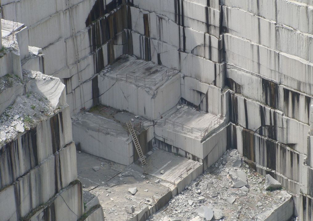
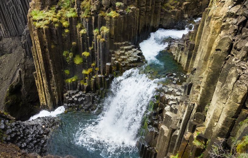
In this case, my objective was to figure out how to attack a medium-sized cliff face while avoiding an overwhelming amount of noise/detail. First off, reference. Starting with some photo reference, I wanted to isolate the primary features, and not worry at all about the small, noisy stuff:
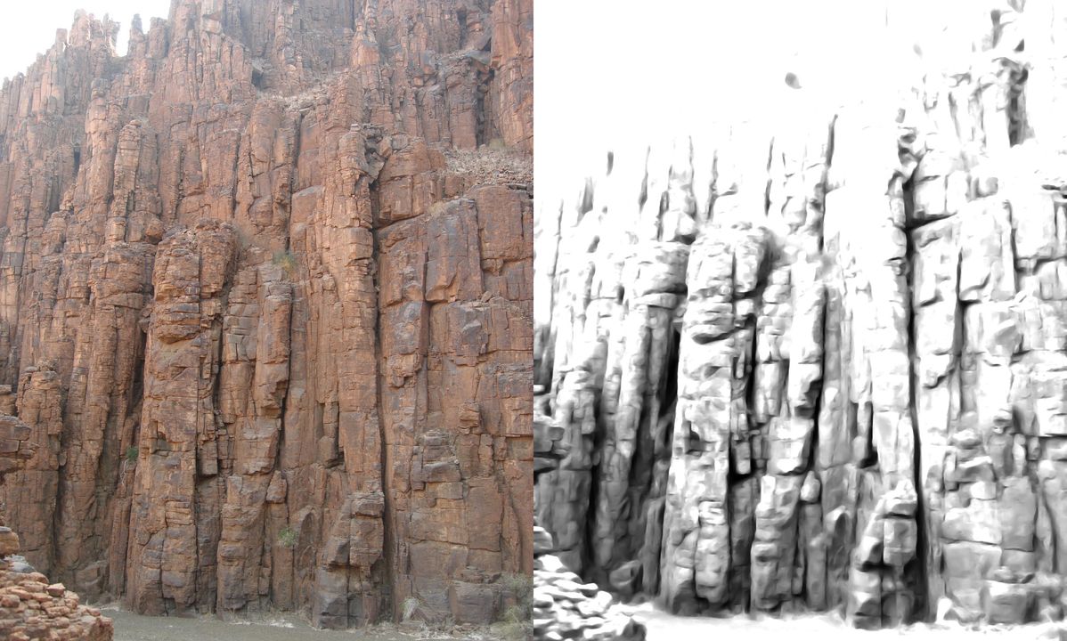
Then, an attempt to stylistically sculpt those simplified shapes:
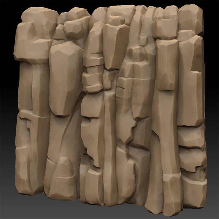
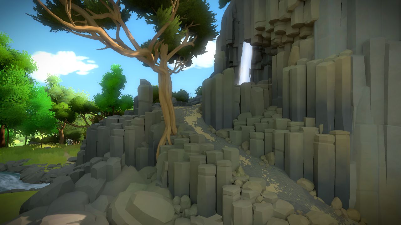
And finally, breaking those forms down into modularized, reusable meshes that could be combined to form a cliff:
One of the biggest lessons we learned from this experiment was that if we give the engine nice clean, simplified geometry (not worry as much about the texturing - just keep it understated and focus more on the overall color and balance), the lighting results we get are gorgeous. In a way this is extremely freeing, as it lets us concentrate on the overall form of objects, rather than obsess over details like perfect seamless, UV mapping, limited texture resolution, normal mapping issues, etc. We also learned very quickly that hard edges are not evil.... In the absence of heavy texture detail, the faceting had become a powerful tool to help define the form in a clean, almost graphic style, with minimal noise, but lots of subtlety.
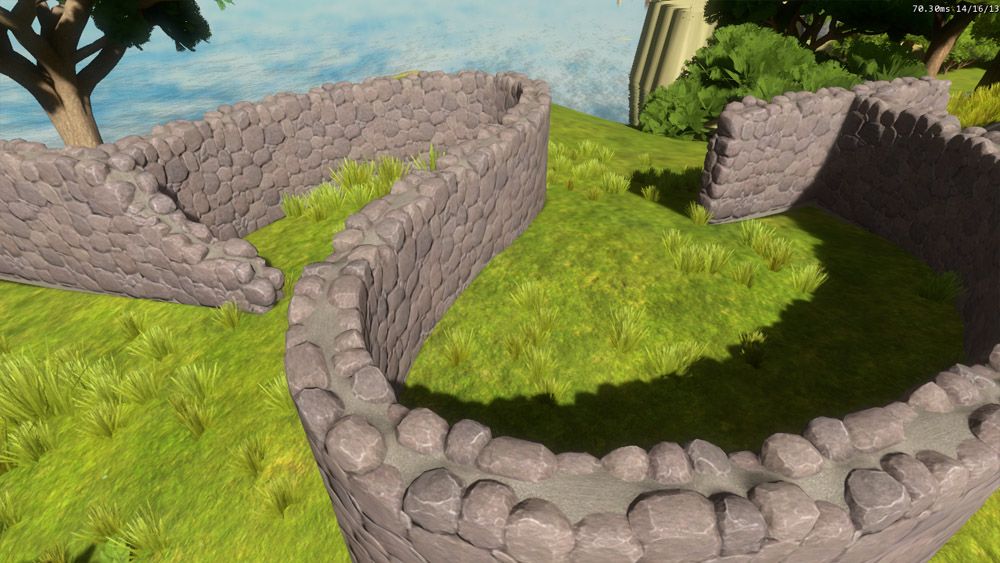
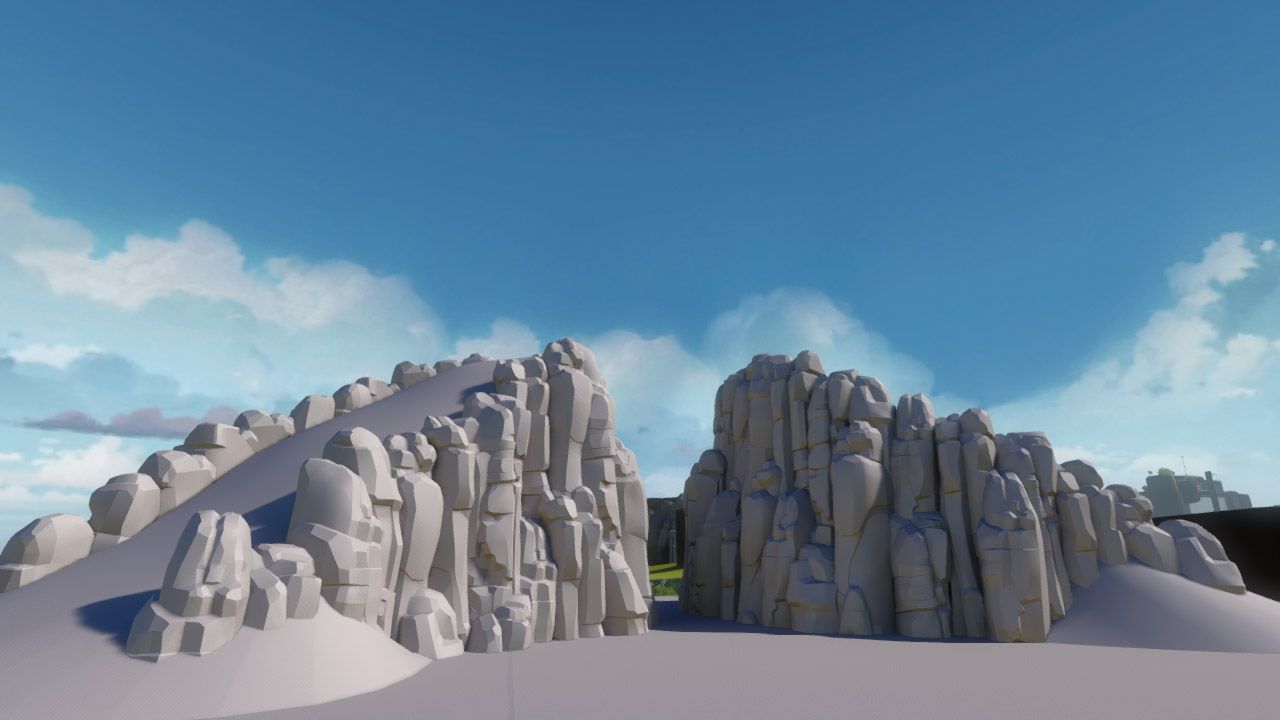
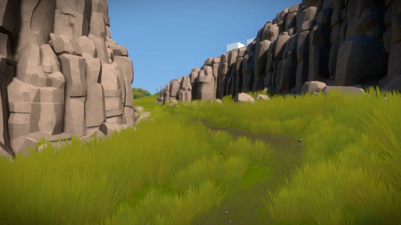
That process of “analyze, deconstruct, simplify” became our new way of approaching complex surfaces. And so, as we built out more areas of the island, this visual language began to take shape,and you can now see it deployed across most of the rock forms in the game...

Take note that foliage has a different language [see Orsi’s previous post on trees], as does rolling terrain, and hard architectural surfaces. But this style contrast is extremely useful from a game design perspective, as it helps inform the player as to what materials the surfaces they are looking at are likely made from, without having to resort to overtly photoreal textures.
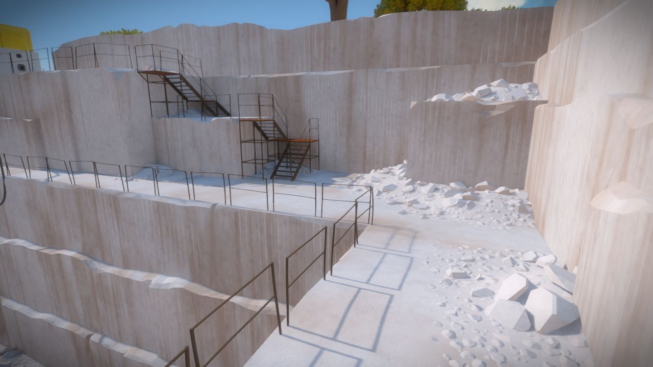
Even older areas of the game (that were suddenly “out of style”) were able to be refreshed using this new lens, and brought in-line alongside the cleaner, less-noisy artwork:
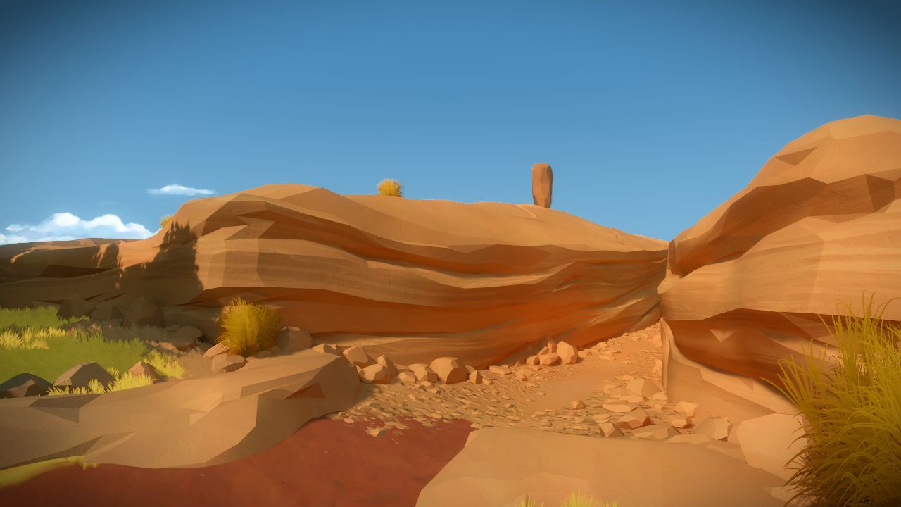
And here’s some additional rock shots from around the island, just because...
Luis’ awesome sculpted sandstone cliffs:
Orsi’s awesome lakeside steppes:
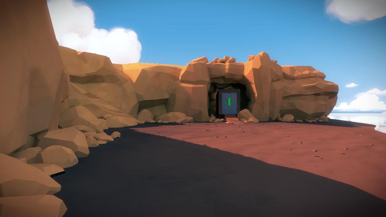
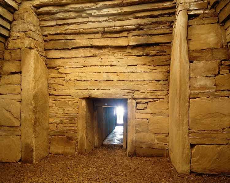
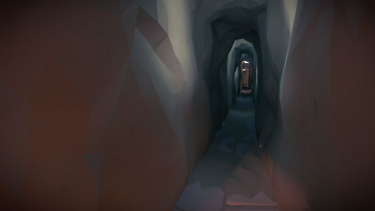
And a bit of mysterious tunnel:
That’s all I've got to share for now. Have a great September!!!
-eaa
Great post Eric. Can’t wait for the game, it’s going to be great! :)
This reminds me so much of the Making Of vid for Riven. But you have taken it a step further: not just mimesis, but mimesis within the context of the playing of a game.
Following this blog makes me feel like I am part of something… and something that it is very much worth being a part of.
Also those are some really pretty rocks :-)
There’s real beauty in geometry!
This reminds me a bit of TF2, and I mean that as a compliment. Allowing the player to fill in details on their own, while allowing yourselves to retain a really clean and still developed world is smart.
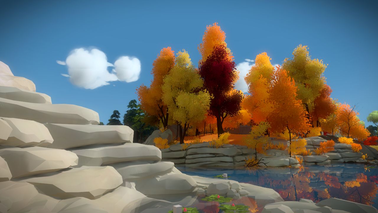
Wow, that second to last picture of the autumn trees would make a killer desktop background.
Basically, you learn how to generate TotalVariation-denoised landscapes. Awesome!
I really love the minimal art style of The Witness. Now the gameplay is still a bit under wraps right now the visuals alone would be a reason to want to play the game. Each screenshot looks more like a painting to me than a 3D rendered scene.
Ok enough of that, now go finish the game already ;)
Beautiful stuff. And I’m curious as to whether this change in style makes the graphics less processor intensive.
Same – if the geometry is so simplified, why the need to release on next-gen platforms?
This explanation seems to fit your question at 12:42 to 14:50 of this youtube video:
http://www.youtube.com/watch?v=HGZ3-SpId3Y
I was thinking of the same thing.
I think you folks have hit on a good balance in the design and geometry of this world; it’s enticing and surreal, and looking at these screenshots makes me long to explore that world. I think that’s what you were aiming at directly.
These shots look fantastic! Simplicity is huge, especially today with so much chatter.
Enjoy killing the noise! Great work guys!
Great post! I definitely like the direction the art style has taken. In some ways it reminds me of Out of This World (Another World), a game I absolutely loved especially because of it’s minimalist art style.
What I also like is that the minimalist art style stays closer to a protoype version of the game world. I remember creating grayscale renders of 3D scenes and liking how it looked before all the extra textures were added. It’s sort of like a grayscale pencil sketch with only small fill ins. I remember watching artists create drawings, and somewhere before all those extra lines, colors and details were added thinking “Stop! It looks good right there!” but inevitably they would add extra brush strokes. It added detail, sure, but were not what I had wanted to see.
If there is some space for your imagination to fill in a color or a line that is not present, I think it is more engaging. If you draw every single line and color for them, what’s left for them to wonder about?
I love the untextured look of those rocks. It seems to allow the light to do it’s suggestive job.
Also, is that the fantastic stone age Maes Howe in Orkney that I can see in “rocksImg-14-300×238.jpg”? Very distinctive corbelled vaulting.
Beautiful work, can’t wait to give this a spin on PlayStation 4.
I’m really not surprised how well this works. I’m also not surprised you’re going for this style. Everything in design (especially on the web) has moved from hyper-detailed to blocks of pleasurable colors in recent years.
IMO, it’s a good move. Looks edible.
I love it!
Sweet, can’t wait to explore!
So excited for this game. I’m buying the PS4 when it comes out. Congrats team, you’re making a system seller, at least for me!
ditto!
What up Eric!? Holler! Thank Luis and Orsi for us for hassling you. Oh and thank you fine sir as well.
This game rocks!
…
That’s just amazing. I’d been trying to think of a way to describe the art style of The Witness beyond “colorful,” and now I finally understand it. The aesthetic of The Witness is “simplified realism”— real objects broken down to their most essential pieces, the pieces that invoke the “feeling” of the structure or object without perfectly representing it visually.
It’s beautiful, so beautiful I published a news story on it. I hope you like it! http://www.gamnesia.com/news/developer-explains-the-witness-deliberately-simplistic-art-style-noise-was
Hey, thanks!!!
This was a good read! Yes inspiring… And also candy for my eyes.
Are you planning on an VR or Oculus Rift support? I would really like to walk through the island.
We are thinking about VR support but nothing is decided at this time.
After trying the Oculus Rift dev kit for the first time (Mirror’s Edge), a friend of mine brought up how interesting and perhaps even optimal it would be to use the device with a more slow-paced, atmospheric title like The Witness. It seems to me that using VR for a faster-paced title would be constantly disorienting but that it could work wonders for letting players get immersed into a “softer” setting.
Of course, I’m not totally convinced that VR is really that big of a deal yet, myself. It just seems kind of useless. I mean, sure, it can probably do a better job immersing you into a game, but is that really necessary? Just a thought. Any chance you could tell me yours?
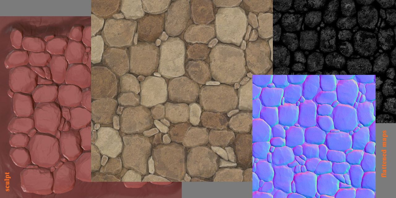
Really great article! Thank you for giving us the insight of The Witness creation process. You mentioned that you sculpted your geometry. What software did you use? ZBrush? And did you had to retopologize the mesh?
We primarily use ZBrush for sculpting tasks. In the case of the specific mesh shown above, I think I retopologized that one by hand using 3DSMax’s Graphite tools… but often we just try to keep our sculpts as clean as possible and simply use a decimated version of the sculpt (hand edited as needed).
Thank you for the reply Eric! :D New Maya 2014 has a really sweet retopology tool called Quad Draw. I love your sculpt of the cliff wall by the way!
It is certainly no easy task to live up to it’s predecessor (Braid) art. specially when you have to work with 3D, where there are so many layers of detail and technical challenges to be addressed. I really like what I see so far and can’t wait to see how it feels in real-time. Regardless the graphics, I’m sure the game will be great, Jonathan Blow, the greatest thinker of video-games, would not disappoint in the very core of game, the design. Good luck on the development!
A MYSTerious tunnel? Eeeeh? I’ll be leaving now…
You should have lots of parkour on these rocks
The geometrical method and limited textures you guys are going for REALLY lends itself to rock materials. Like in the quarry in particular, just freaking amazing!