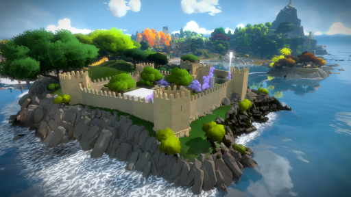
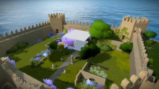
Here is the progress for today. Detail has been added to the rest of the walls and towers as well as windows and other smaller features.
We've had some discussions about the style of the battlements so those might change tomorrow or after.
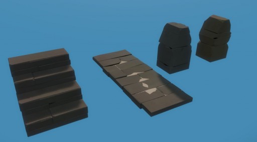
Here are the new modular pieces that were done for detailing:

We just finished the day by meeting with the architects and discussing the interior layout of the space so tomorrow I'll start on the interior building and ruin walls.
Here is how it currently looks:


Wow, what change one day can bring! Looking fantastic! Thanks for posting! I am ready to eat up anything you folks offer up here. I really like the little windows on the square spires, they are true to life and look fantastic dwarfed by the very wall that surrounds them.
Also if I’ve said it once, I have said it a hundred times: The rocks in this game… I prefer them to ACTUAL rocks. What has been accomplished here is something remarkable and if I remember correctly, games in general haven’t really nailed style like this other than Team Fortress 2 or Dishonored and this is a step above, on par with that smoothness found in Journey!
Gah! Polish this game until it glitters! Just not too much, just like human beings some faults or asymmetry can be endearing and beautiful too.
Those purple blossoming trees are killer.
PEACE!
Was a lot of the art work already finished and just re-arranged and edited or something? You guys are zipping through this. Nice work! I can’t wait to play it in a week!
A lot of redoing from scratch but at this stage we are very comfortable with the art style and already have a nice pool of textures, tricks and editor tools that make everything faster.