This is an experiment in writing up a blog post for a development task while I actually perform the task! So right now, as I start writing this, I don't know how it will end!
I was talking to David Hellman about the game the other day, and he was asking when the island was going to become less like a flat plane where you can just walk to any destination from anywhere else.
It's been on my to-do list for a while to add more topology to the island. That week I had been working on an area full of puzzles, and I wanted the buildings that define this area to have more of a purpose than they currently do; a topological purpose seemed like the right thing.
So I figured I'd add a canyon, and the building containing these puzzles would also serve as a bridge across the canyon.
The natural way to build the canyon in this engine is to shape it out generally with terrain control points, and then make the walls steep by putting mesh objects in there (so that you can't walk up them, and so that the walls of the canyon won't look super-distorted the way heightfield terrains usually do when there are steep slopes.)
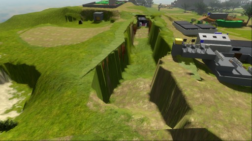
Here was the first cut at it:
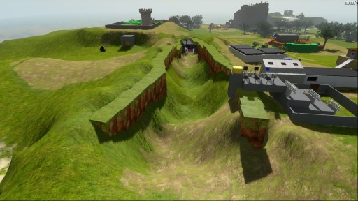
As you can see, there are a lot of weird ripples and curves happening there. This is what signal processing people might call "ringing". What's happening is that the Kriging system that we are using for terrain modeling is always trying to reconstruct a smooth function, but what we are trying to build here is a discontinuous function (or else a function so steep that it has a lot of high frequencies in it).
There are a number of ways that one might fix this, but the cheap and hacky one, which would work not only for Kriging but for any other terrain modeling stuff we might stick in in the future, is to add the notion of separating planes that represent discontinuities in the terrain. When evaluating the height of the terrain at any point, we just ignore any control points that are on the other side of the separating plane.
Adding discontinuities has been on my to-do list since last year when Kriging was added to the engine. It was pretty obvious that it would be needed eventually, but in the spirit of getting things done and not rat-holing on technology, I chose to put it off for as long as possible. But it makes sense that if we are starting to add more topology to the island, we are going to want to have more steep places, and so it's time to add this.
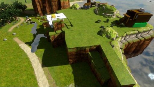
(We've already had this steepeness problem before, though: if you look at this plateau that is near the camera in our regular island snapshots, you'll see that the whole thing is made out of mesh objects, rather than terrain; we did this in order to avoid this very same ringing problem:)
It didn't take long to add discontinuity entities into the editor; here's how they are represented:
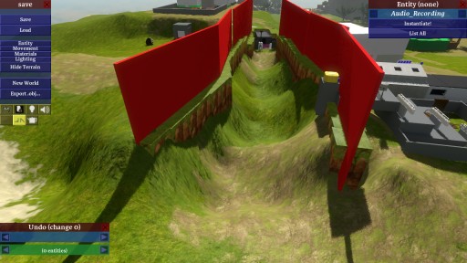
To start with, I just used a really dumb heuristic to decide when control points should be excluded. When we use this, here's the result:
There is still a bunch of heightfield terrain sticking out. What's going on? If we look back at our red discontinuity planes, it is clear that there are some terrain sample points inside the canyon that are getting treated as if they were outside:
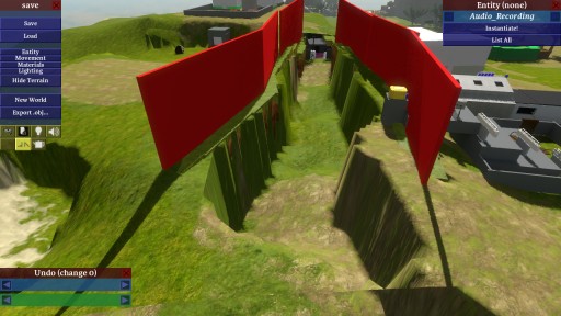
What's going on is that my simple criterion said "if you are on the opposite side of a discontinuity plane from a control point, ignore that control point". The problem is that I am treating them as infinite planes, so those points that you see, which are in front of one plane, are actually outside a neighboring plane, if you were to extend that plane infinitely. This is no surprise; I knew it would be a problem, but I am always about implementing the simple thing first and seeing what happens. But now I need a heuristic that will fix this problem.
One solution would be to combine the discontinuity objects into sequences of points, and then do some more-heuristicky things that may be easier because we have an ordering between the points. But I don't want to resort to that if I don't have to, because that may make the system less general, and may make it harder to edit. (Then again it may make it easier to edit, because we have editor support for paths! But if we want to, we can easily go the other way, from a path down to individual slabs, so it's better to take the most-primitive thing as input if we are able to.)

I added a check that would make discontinuity planes irrelevant if the sample points are closer to the side planes of these very thin slabs than they are to the face planes. In theory that would at least help, but upon running this, the scene looked almost exactly the same.
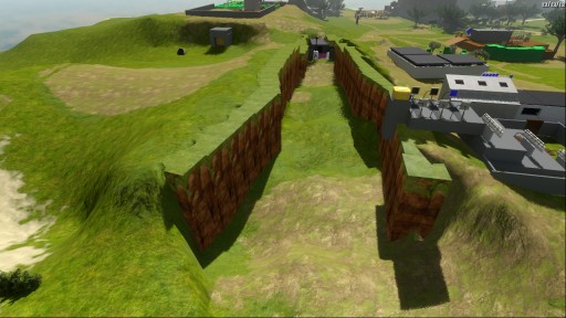
Then upon further investigation I found that I was computing totally wrong planes in the Kriging code; I was transforming the coordinates incorrectly, and so the planes were not in fact where the red slabs in the picture would show them to be. I fixed this:
Ahhh, much better. This seems like it will be good enough for now. There's still the question of how to seamlessly blend the heightfield terrain into the mesh objects, but that can wait until closer to ship. For now, it doesn't need to be pretty; it just needs to let us build things of roughly the right shape.
The heuristic I use for discarding points is still pretty simplistic and may cause problems. My hope is that most of those problems can be worked around just by changing the planes a bit. If that turns out not to be true, a little more work will need to be done here!


Regarding seamless blending, why not implement a special entity for meshes that would allow Kriging-like interaction with the terrain on a single face?
Well, I think things have to be even more precise than that. Decisions have to be made, like, does the terrain mesh actually have to join to the vertical-wall mesh? If so, then there has to be a dedicated seam (probably designated in the vertical-wall mesh) at which the wall and terrain meet, which will be set up identically so that we don’t get cracks due to floating-point error. Except wait, LOD will introduce cracks anyway, so we probably want to treat the meeting segments here like the boundaries of any terrain segment and hang skirts down from them to cover LOD cracks. I don’t know… I haven’t thought about it.
My inclination would be to bend the terrain to meet the mesh, rather than to bend the mesh to meet the terrain. But we’ll see.
Very interesting.
Also loved that we get a more up-close view of the island, which I do not remember getting before.
This game looks more and more amazing every time we get a glimpse at it from you (guys). My friends think I’m insane for calling this my most anticipated of 2011, but after still contemplating the fine points of Braid weeks after my completion, I know this game will be amazing, too.
i just recently started modeling and using layout to animate and create 3d environments but i can understand some of what you say, not enough to help or give some sort of insight on what could be a good idea or just kind of cool. i guess that all of us following you know the Witness for looks and not much for gameplay so the only thing i can comment on is the graphics, and they look beautiful. the island geography is looking lovely and the whole island even though is a place holder it looks very interesting. it looks man made like a man made island. this kind of post were you do development and comment on it like a twitt seems like a cool idea bc maybe somebody that knows a solution can help you while your doing it. keep up the updates and good luck with the topology and all that
btw i forgot to say… great that you are talking to David Hellman, he’s awesome he is so great. is he close to the Witness or just like a friend you like to consult? he had some great ideas for Braid you should let him help you with the Witness
Any chance The Witness will be released on osx by any chance?
Dear John,
is there a connection between The Witness and Oracle Billiards?
Thank you for answering
Jakub
The Witness is not related to Oracle Billiards in any way except that I made Oracle Billiards.
It’s possible The Witness will be released on OS/X, but who can say? Honestly I don’t like these kinds of platform questions, because they don’t seem very important, ultimately.
Dear John,
sorry to keep bothering. Is The Witness based on any of the prototypes you have on your site?
Thank you
Jakub
P.S.I noticed something very interesting when I kept watching the gameplay video of the game on youtube. When you get close to the touch panel, something appears on the screen which wasn’t there before – some kind of white rectangular thing (on the left side of the screen, for instance). Very interesting…
Pingback: Update | The Witness
No, The Witness is not based on any of the prototypes on my site.
pc gamer interviews jonathan blow:
link: http://tinyurl.com/46jrxs4
or (maybe) click on my name
Why not do discontinuity *volumes?* That fixes this problem and allows for more-interesting shapes as well. Just have a big brush which you add in the map editor, and the lines where the terrain intersects with the sides of that brush are discontinuities.
Potential problem: What if the result of the discontinuity is to move that plane out of the brush? You’d have to either prevent that in the editor or clip the terrain to the boundaries of the brush.
By the way, does the terrain system in The Witness allow for floor-above-floor, or must everything pass the vertical-line test?
Since terrain is a height field, you can have it be a discontinuity “volume” but where the testing only occurs in 2D. Then you would never move out of the brush.
But the reason I don’t do it this way is that I need these things to cover really broad areas. Like, if I am a point at the bottom of the chasm, I don’t want to be influenced by any of the points at the top. So to accomplish that I would have to build huge boxes up there. But then, I would also have to mark up those boxes somehow as only affecting the bottom of the chasm, because otherwise, how are guys on the top surface, near those boxes but outside them, supposed to know the boxes don’t apply to them? I think it would get complicated pretty fast.
The terrain itself in The Witness just has one elevation (no floor-above-floor) but if we want that we can just put a mesh object in the game.
Well, if a point does not fall within the 3D volume of the brush, it’s not affected by it. (Or if it doesn’t fall within the 2D cross section of the brush.) The way I’d do it is, each discontinuity volume has its own distinct height field, and anything within that volume uses this height field instead of the “main” one.
Anyway, you seem to have figured out another solution that suits you. :)
Was it Crysis or Rage which was going to have a new kind of height map which allowed for overhangs and such?
I’m kind of disappointed to see this very old and crude technique applied in this game, since Braid seemed so elegant and used 2D graphics in a very innovative way… you know, the way you assume the background is a static painting the first time you see it, until you notice that the brush strokes seem to move, and finally you discover that the “painting” actually consists of a whole bunch of pseudo-3D layers when you start to move in it…
Here? Nothing you haven’t seen 10 years ago already.
Hopefully, the graphics aren’t the only placeholders, but the modeling technique too. I know Mr. Blow doesn’t want to do what is expected, but I must admit I though this game was going to look like Eskil Steenberg’s Love, which at least I get a Braid vibe from.
Anyway, some people disliked the art direction in Braid, and here I am dissing The Witness before it’s even out.
Wait, what? The thing you are talking about in Braid is “parallax scrolling” which had been used in 2D games for way more than 10 years! And yet you were impressed by it somehow; what a paradox.
We can have overhangs if we want… we just use a mesh for that, and figure out how to blend it into the terrain (this latter step is TBD but we have a basic idea of how we’d do it).
Mmm, no, what I meant more was the combination of parallax scrolling, interpolated animation and the alpha channel of the 2D art which when put together produced this very clever effect of a 2D painting’s brush strokes seemingly coming alive. The scrolling was just icing on the cake.
So sure, 10 year old techniques, but which in combination produce something which felt very fresh and knocked at least my socks off.
Comparing to Love again, voxels isn’t really anything new either, but together with the shaders and the curved world, the combination is equally clever.
Just now I saw the Monocle engine, with the way it stretches and blends 2D graphics and it’s just amazing. But perhaps it’s 10 years too early to ask to see similar developments in 3D?
Were ‘2D graphics techniques’ or was ‘immersive game play’ the lure of Braid?
You have a vision, and then a means of realizing it. If you’ve ever visited Jonathan Blow’s website, you’ve seen that he’s devised plenty of innovative solutions to common problems. But I don’t think that’s why he made Braid, or why he is making The Witness.
There are plenty of tech demos available if you want them. Here: http://www.siggraph.org/
I think I understand where eobet is coming from on the Braid side of his point – I can see why he would think Braid was innovative in its graphical design. In a sense, it was and in a sense it wasn’t. Braid took a few techniques and combined them. Parallax scrolling was used in brilliant conjunction with particle effects and that is what made Braid look unique and “like it was being painted”. Because it’s true, the background was generally moving and it looked spectacular.