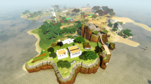
As mentioned in the previous couple of updates, we are starting to take steps toward establishing the visual style of the game. This past week while I was on vacation, Shannon did a bunch of world editing, with the primary goal being to draft out a few areas of the world that have different color schemes, as concepted in this post. Here's how the island looks with all the new trees, rocks, etc added:
Much denser and more visually interesting; it's starting to look like maybe a good game!
Here are some close-ups of different areas now.
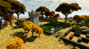
Autumnal:
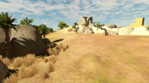
Desert:
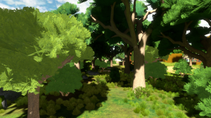
Foresty (there is a lightmapping problem on some of these trees so they are brighter than they should be!):


Gorgeous! Looking at the island it looks kinda small until you see the boat and realize how big it really is and how those trees are huge
You’ll also notice in these shots that we have added detail back into the terrain textures. Ignacio implemented a system similar to what the Wolfire guys do, where the repeating detail texture is color-corrected so that its average color corresponds to the whole-island-color-map’s color at that position.
i have the incredible urge to walk through that forest.
This is the first I’ve heard of Witness, these screens look beautiful. I had such fun with Braid so I know this is going to be fun. :)
It has really been coming together lately, looking great!
I’m so curious how you guys will manage do deliver fps experience in such manner. I hope I will be able to present the game to more non-game oriented people. My mom had some issues with platforming in Braid so she couldn’t get the whole experience and yet I know it was only because of that. Is this something you’ll be tackling?
Hmmm. How are you going to handle the grass? It seems like the biggest remaining eyesore in the shots.
Do you still have plans to change the grass? I remember reading a while back that you wanted to change it around a bit, and possibly add shadows. It looks pretty good already, though maybe a bit tall… in the autumnal area, it looks like it’s three feet high in some places!
I really love the look of the autumnal area, by the way. The verdant area looks kind of weird with the lightmapping issue, but if it ends up looking similar to the concept shot, it’ll be great too.
Looking good!I have a really strong desire to play through this game.
Keep up the good work,team witness.
It’s likely that we will at least improve the “ambient” lighting of the grass in the near future.
It’s also likely that we will start introducing more variety, so the grass doesn’t look like the same bitmap over and over. In some areas where we have done this it looks *way* better.
After these two things are done we’ll assess what else may be helpful!
About the game being playable by non-gamers: it is my hope that this will be true, but we’ll see. It’s hard enough to make a good game that is this unlike other games… one can only solve so many hard problems at once.
The island is looking very good! It may be nice to add a small pool in or around the forest, if the reflections are working. If you want to do some really nice indoor lighting, maybe this article is a good read: http://developer.download.nvidia.com/SDK/10.5/opengl/src/xmas_tree/doc/GPU_ChristmasTree_Rendering.pdf
btw, it would be nice if you’d add a Lost reference. Maybe a button and hieroglyphs in a bunker or a hatch?
This is looking more and more exciting with each new post!
With regards the grass, I think the point where it meets the ground is the issue – I suppose changing the ambient lighting will make these two contrast less so that would be good. Is it all possible to feather the point where the grass meets the ground, or always make sure another smaller piece of less contrasting grass surrounds the base of larger grasses? This might help smooth the transition between the flat ground and the vertical bitmap of grass, and be more visually pleasing.
I’m sure you’ve tried loads of different techniques already and this isn’t very useful – after all, I don’t know if any of these ideas would be too ‘expensive’.
Keep it up though, I can’t wait to play it, regardless of how the grass looks!
It’s my belief that a game that is unlike other games is far more likely to be accessible to non gamers, maybe so long as it also has a slightly slow pace. If you’re making a different game for gamers, you’re obligated to carefully express to them the unusual rules of the new world they’re in to them. There is very little of their existing gaming volcabulary that can apply. And non gamers reap the benefits of this too.
I’m basically referring to the seminal “puzzle games” of the last couple of years: World of Goo, Osmos, Portal, maybe Braid etc.
>i’d be nice if you add a LOST reference
>do a Braid tie in
>i’d be nice if you ….
>i would like to seee…
>it would be cool if like…
>can you put….
>read this
>fix that
>don’t do this
ohhh lol!
lost sucks, is wayy too long and j.j. abrams sucks!
looks really nice :D
I’ve just realised what this game sort of reminds me of!
My brother got 3d Construction Kit (aka Virtual Reality Studio) back in the 90s and used it to make puzzle games for me to play, it was the first time I had seen anything like this.
Jonathan, I’d be interested to know if you ever came across 3DCK, if you had it would be great to think it had influenced you on some subconscious level – it was ground-breaking stuff at the time!
Have you tried rendering the trees, grass and other foliage in a more abstract style? (similar to some of the paint over concepts)
I think the foliage looks a bit too detailed compared to the other terrain and architecture at the present time.
looking better and better. but personally im not to fond of the grass in the autumn picture, just looks off to me.
The grass is OK, it’s true that it’s just a little to tall, but I’m sure you’ll figure out how to make it really *way* better.
The only thing I would do, is move that lonely tree near the shore a little to the left because its blocking the beautiful reflection of the windmill.
I’ve never seen grass done quite right in a video game. Because of its physical properties in the real world, it becomes so hard to render in a virtual scenario. The grass isn’t perfect, but I doubt it will be for some time, at least not in this console generation – (I know you’re developing for PC).
Autumn area looks amazing!
I was wondering what musical style we can anticipate in The Witness?Will it incorporate a orchestrated/classical style that was present in braid?
And whether or not we can get a teaser of a song featured in the game?
At present there is no music in the game.
The focus will be on creating interest with environmental sounds.
Hells the fuck yeah!
That’s music to my ears. Thank you!
Nice! I’m really liking the trees, they look really, really good. Better then most games I’ve seen, actually. They look quite high poly though, hopefully you won’t have to reduce or change them because I like them.
“Probably I’ll start posting soon about other aspects of the game, like the story design or the puzzles. We’ll see!” feb 8
omg c’mon! its been a long time already. i don’t want you to spoil anything or tell us something really important in the game but just like a little something… i dont know what though.
Watching this game unfold is the best kind of self-inflicted torture. I’m so anxious to play it!
No kidding, scooterbaga. :(
Re: tree shading, I actually like it. It gives the scene a dreamy, not quite real look. The high contrast render is uncommon and really quite appealing.
The grass being made in a similar way the the Xbox360 Kinectimals game would be beautiful, it looks colorful and fluffy.
http://g-ecx.images-amazon.com/images/G/02/uk-videogames/2010/Xbox/Kinectimals-SubImg1-big.jpg
As for the the trees, I agree, they would look great if more stylized.