Quite some time ago, Ignacio put some color grading features into the engine, so that you could tell the postprocessor to tweak colors in particular ways. For a while these features were very experimental; we just had them on a debug menu and there wasn't a way to save the settings. We didn't really use the features (in part because we were pretty busy just getting the basic parts of the game together).
Lately, Ignacio and Salvador took the features all the way so that we can use them easily in normal workflow. (This happened over some period of time, but the last parts came together this week). Now you can take a screenshot, screw around with the colors in Photoshop, and load it back into the game to control the grading. I am pretty sure this is not our idea, and we got it from the Uncharted guys or someone like that (Update: The idea was developed by Naty Hoffman and others; see the comments to this article).
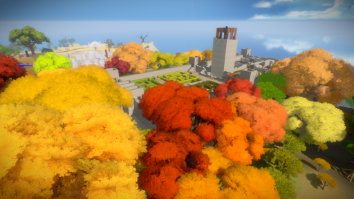
Here's how it goes. First, I find an area the look of which I would like to change:
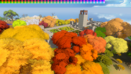
Next I hold down the control key while taking the screenshot, causing it to be saved with a special color bar along the top of the image:
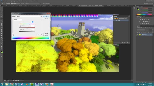
Then I go into Photoshop and screw around with the colors. Here I am using the Hue/Saturation tool to shift the palette away from red:
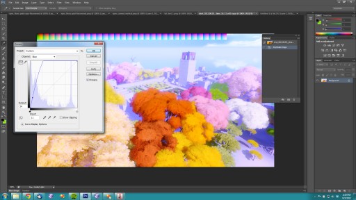
Or, instead, I may wish to shape the histogram of the image:
That color bar at the top of the screen acts as a look-up table. The game doesn't need to understand what operations we have performed in Photoshop; it just knows what that color bar looked like when the screenshot was saved out, and, by comparing it to the colors in the result, knows how to transform any color in the rendered scene.
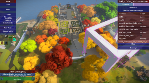
In the game, you can now attach these grading operations to spatial markers, so that color grading kicks in when you are inside specific areas. Here I am setting up some markers in the editor (the marker is the big white box):
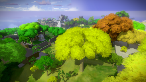
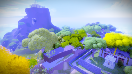
After setting up two of these boxes, one for each of the two weird color operations I created, then I can walk around in the game and have these operations apply to everything:
This gives us a really nice degree of control over how the game looks. We plan to use it to help with the color theming that will tie together specific areas.


Beware of color banding! :)
Thats more of a Tech/monitor problem :(
Here’s hoping this is the first game that really gets color grading right. Good color comes from a subtly different takes on a consistent visual signature, so I trust we’re in good hands.
Well, our actual color grading will probably not look like my examples in this post… so that’s something.
What a nice post on an nice aspect of the stuff you’re working on!
Please keep these coming, Although I’m not sure at what point I’m going to stop looking so I don’t spoil the game for myself!
Maybe you should put all of these posts plus more work in progress things into a book to come out after the game, “The making of” ( with a download code to get 3d files/videos to look at too!)
We did this in God of War 3, but I can’t remember if it was our idea. Tim and Ken were messing around with it just after we shipped 2.
Phil – I came up with the idea shortly after I started working on God of War 3 – I think someone else at EA came up with it independently at about the same time. It’s a fairly simple extension of the ideas in http://http.developer.nvidia.com/GPUGems2/gpugems2_chapter24.html though.
Cool. I’ve stuck a note about this in the article.
That sounds right Naty. Reading the engine code this morning, I can see that we had a system in place prior to using bitmaps, but it was 30 or so parameters, presumably attempting to reverse engineer the Photoshop filter. That’s almost certainly the system Tim was working on. We still use them, but for more designer sourced effects. They can be edited directly in-engine so they have a rapid iteration cycle, while our Photoshop & bitmap path is a bit longer as our textures are / were baked offline.
Eric had to re-write chunks of my effect blending code to get the two versions to co-exist. It looks like we convert the parameter based system into a colour cube, before doing the final blend.
With every post I get more and more excited to walk around on this island myself. Great work, can’t wait.
We cannot take much credit, this is pretty much the standard approach these days:
http://renderwonk.com/publications/s2010-color-course/
However, our implementation is nice in the sense that it required *very* little development effort and is very easy for the artists to use. For example, UE3 requires you to crop the look-up table to input it in the engine. That not only takes time, but makes the tables much harder to identify. By keeping the modified screenshot by the side you can easily tell what effect the table was intended to achieve.
Interesting – do the shaders compare the before and after palette textures in realtime, or do they get distilled down into some kind of color mapping formula?
That strip in the top left is the colour mapping formula. The 32 squares are stacked, to make a 32x32x32 cubic texture. In a pixel shader, the RGB values generated from texturing + lighting are used to look up a point in this texture to discover the colour that should be written out. Red is right in a layer; Green is down in a layer; Blue moves across through the layers.
There are 256 possible values for each of R, G and B, but only 32 corresponding values in the lookup table. The graphics card fills the gaps by interpolating between as many as 8 different samples to give you the final colour. Fortunately, this is what the graphics card’s built for! The whole thing is a single texture lookup so it’s ridiculously fast.
That interpolation loses you some control… but because the texture itself is only 32x32x32, it takes up just 128kb or less of video memory, and you can afford to blend multiple colour look-up tables on the fly before each frame even on low-end hardware.
Aha – thanks for the explanation. That’s really clever!
Keeping the screenshot along with the color table is an excellent solution to preserve the context of the change—the graphical equivalent of commenting code, I guess.
Colour grading tools can also help to evaluating the accessibility of your visual design for colourblind players (a not-insignificant percentage). You can use colour tables that simulate the reduced colour spaces of different forms of colourblindness. If you use colour as an important element of any puzzles, or as an indicator within your GUI, you should evaluate your colour choices in this way. For example, I demonstrated this technique using the Source engine’s colour grading tools here http://backslashn.com/post/7669124799/colorblindness-simulation-in-the-source-engine
In film making colour grading is always the very last thing we do.
Is this the end of development? or an early experiment?
In that screenshot where you set the colour marker, I noticed that the editor’s UI is similar to that of Braid’s. You mentioned before that there won’t be much support for user-created content, but do you think the final game will also have a command-line method of enabling the editor? Or could it seriously mess up the game so you’ll just take it out?
There is not much point in exposing the editor for this game. It’s not like Braid where you could make more levels that make sense.
Cool work, and good luck!
Just be sure that the unaware random player does not notice. They tend to remove any color grading because it is not “realistic” and wrongly tweaked. Like in Rage, Skyrim and many other games. They don’t realize that there is color grading everywhere ( movies, photography, …) and that it is an artistic choice.
Nice!. It would be really cool, also, that some parts of the maps’s colors change as the story progress. Or something like color solving puzzles (if that makes any sense).
I don’t think this color thing it’s a step forward in the progress of the game but maybe it’s an opportunity to experiment a little bit whit it.
Ignacio,
Posting this and some of the earlier articles on the lightmapping to facebook has encouraged a whole bunch of lighting artists on my friends list to consider making the switch from animated films to games. Keep this up and you’ll start attracting some seriously awesome talent away from the film industry.
The stuff you’re doing here is SO freaking cool!
This game would be simply PERFECT with the Oculus Rift. A slow look around / puzzle solving game in headtracked 3D.
Would you guys consider that? So far only Doom 3 BFG Edition is announced as having Oculus Support, you guys could make a real splash if you were to support it.
I like the elegance of this solution. Don’t reinvent the wheel, right?
When can we expect to see a new video?
I really can’t get enough of those trees. They are so FLUFFY!
I like this solution. Good separation of concerns, as the designers can just keep playing around until the mood is to their desire for every area. And the editor that you guys have built up is fantastic. Would really love to see another article on the editor.
I have never taken much consideration to colour correction and colour grading (my games have never got to a stage where that was required), but seeing this solution, and the previewing you can do in Photoshop, just seems genius!