Until now, we had been using Uncharted-2-style blend mapping to color our terrain. This is a way of using a low-resolution texture map to control the blending of high-resolution textures; this gives you the ability to maintain fine pixel-by-pixel detail while also blending between multiple textures in order to create larger-scale patterns. (This method is in effect in earlier screenshots like this one, though keep in mind that we were not using it very seriously in a whole-island kind of way yet. For some idea of what the blend mapping looks like closer-in, see this or this.)
But now we are thinking about how to create colorful scenes, like in the previous post, and this style of blend-mapping did not seem like a very good idea. In order to create gradients across the scene, we would need to have a lot of blend layers; this would be slow and use a lot of texture memory (since now we are storing a lot of individual blend maps). Even once we did that, it would be laborious to control, and it's unclear that it would look good.
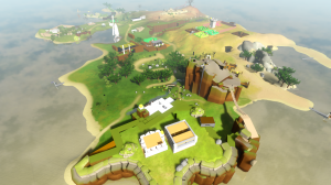
Ignacio mentioned that the Wolfire guys were just dropping one color map across their whole terrain. That seemed like a good idea to me -- I have done that before, but in contexts where we were trying to really crank up the resolution to levels that were ridiculous at the time, like 8192x8192 texture maps back in 2001. Rather than doing that, the idea now is to just use what is a reasonable-sized texture on a modern machine, and see what it looks like. So Shannon painted a 2048x2048 texture of the island (of which we are only really using less than half right now) and here's how it looks from up high:
Immediately this strikes me as much nicer, and much more in-tune with the art direction we want for the game. The buildings and other meshes now stick out like sore thumbs, but that is just what happens when you improve only a part of the scene. We'll be working on this.
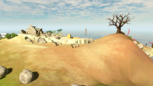
Here's a scene from closer in:
As you can see, we have less detail close-up on the ground; things look a bit blurry. However, the colors are a lot better, and I think if we can adapt this scheme into something that permits sharper details up close, we will be able to make something that has a lot of character and looks special. In these shots, we are still using the old blend map system to tile high-detail normal maps across the terrain; that helps, but by itself it's not enough. (In recent videos for Overgrowth, like this one, you can see that they are doing something that provides close-up details, maybe just intensity maps that are being modulated by the color map). So we'll keep working on this and see how it goes.
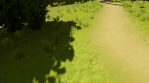
Meanwhile, Ignacio has been revising the shadow map rendering. We used to have very speckly shadow maps, as I was using a 4-sample Poisson disc to sample the shadow map. Ignacio recently switched this to a Gaussian that has more taps, then applied some math tricks to reduce the number of taps. This results in softer shadows:
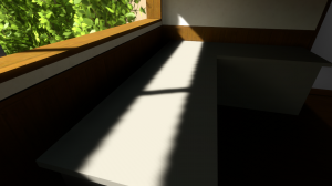
At some angles, shadow map jaggies still show up pretty clearly:
This is something we might work around in the final game by changing the scene when this happens! Or, it's possible the shadows will be modified further so that they look smoother in cases like this. Who can say?


It actually does look good with the 2048 as well. Is there any SSAO or otherwise currently?
We don’t use SSAO; precomputed illumination fills that role in this game.
The 2048 looks good in a certain way but it is blurry. My eyes keep trying to want to focus to sharpen the image and that causes eye strain! These things aren’t good, so we will be working to improve them. But as a basic underlying color layout it works great.
That is looking great! In Overgrowth there is one big color map like Ignacio said, but it’s also used to tint four full-color detail maps to maintain close-up detail. If you’re interested, I describe the current OG terrain rendering in links 6-9 of this overview: http://blog.wolfire.com/2010/12/Overgrowth-graphics-overview
I think the only thing I added since then is a slight distortion filter to the color map to break up the square pixels:
http://dl.dropbox.com/u/3236655/square.jpg
http://dl.dropbox.com/u/3236655/perturbed.jpg
Thanks, I will definitely check that out.
Already I’m sensing that the aesthetic is going to be something special- good progress is being made here. What I’d give to just jump into a screenshot and look around.. I suppose a goal of yours for the art direction is to invoke that feeling, eh? :]
David, thanks for the links. Something that Jon didn’t mention is that we use bicubic interpolation of the color map precisely for that reason, to avoid the orthogonal bilinear filtering patterns.
I should write a short article about the shadows. What we have now is not perfect, but I think it’s a good compromise. To eliminate the jaggies entirely we would need a wider filter, but that is much more prone to light leaks and acne artifacts, and would impose more constrains over the geometry.
What about stochastic sampling? Rotate your poisson-disc each pixel by a random 2D direction (using a tiled vector2 [normalized] noise texture is what I have seen before). If done in light space when sampling the light depth map it won’t jitter when the camera moves. It should trade jaggies for noise. It’s kind of heavy duty, but the xbox360 could handle it just fine. I don’t know if the gaussian filter would fit with this though. Is it a screen-space gaussian filter? like render the shadows with the 4-tap disc, gaussian blur them, then apply them?
Actually, my old version of the shadows, which Ignacio replaced, was rotating the disc each sample by a noise texture (it was a 3D texture with one scalar value, because the rotation value was based on the worldspace position, and I didn’t want streaks to happen at weird angles due to projection onto the plane of the noise texture).
It did not look great, though in talking about it later we thought that maybe I had missed something or made some fundamental error that caused the shadows to look worse than they maybe should. But we never figured out exactly what that was.
Looking great you guys! Love to read about how this is coming along :)
Everything is coming together. Looks great!
fuck peter moluneux….
http://www.eurogamer.net/articles/2011-05-19-dev-poll-molyneux-is-1-industry-hero
your # 3
you have some interesting quotes in the start page, some of them make me think that what the game will be about is what i thought it would be! i subscribed already… but you know something about the page? it would be cooler if like the picture changes too! put some of the old concept art and stuff like that!
as i said a few comments ago the animation is going to be done soon. its looking… pretty ugly but i just copied the place-holder graphics and tried to go by Totilo’s video and i was just adding more stuff, but my animation is bad and first person looks very clunky and jerky and slow.
but when im done i’ll post i link and also make sure you post a link too, to your UC Berkly lecture and the upcoming UC Santa Cruz panel when they are up!
also congrats for being #3 developer (soon to be #1 amirite?) your like a hero to indies ;_;
Hi, this is off topic but, will the game have a linux/mac version?
this looks great keep up the good work, and is there any chance this engine can be ported to the psn or is it incompatible
Looks good. Ignacio, it would definitely be interesting to hear what you did with the shadows. It seems everyone has a few tweaks and ideas to get them looking better.
You guys should probably give up on making the witness, I think someone’s already done it http://bartbonte.com/14locks/
lol… i saw it at indiegames and i a thought “omg that door reminds me of TW im gona post it at the blog” you beat me to it. im stuck on room 4