Something like a year and a half ago, when I was starting to get serious about making The Witness, I was talking to Casey Muratori about 3D modeling and texturing. Braid was a 2D game; The Witness being 3D meant that it would be much more expensive and difficult to make, so I was doing a bunch of thinking and seeking advice on the right way to do it.
I had been viewing a bunch of online portfolios of 3D modelers (and lamenting the quality of these portfolios) with an eye to hiring someone. Sometimes these portfolios are shown in steps: here's the wireframe, here's the filled-in geometry, here it is with lighting, and here is the final thing after it's been textured. Casey pointed out something interesting about these that I knew was true as soon as he said it: most of these portfolios look worse than they need to because the texturing ruins them. When you run a radiosity algorithm on a scene full of unpainted geometry, it has an elegant, sophisticated, scent-of-the-real kind of thing going on; but it is very easy to spoil this sophistication through texturing. And, it seems, in video games we have developed a tradition of "bad" texturing, whatever that means: unsubtle, unrefined, or just plain ugly.
We're on a low budget here, being an indie game; so not only was it an open question how to solve the Ugly Texturing problem, but we also needed to solve it with relatively little manpower.
I knew that, ultimately, we could just fall back on untextured geometry with lighting, if we had good precomputed lighting. That's why we spent so much time and effort putting together our lighting system (as has been written about many times in this blog). The question was, would we stick to vertex colors on most objects, or would we use some kind of texturing?
Early on, we identified a texturing style that would work for human-sized objects and would gel with the gameplay of The Witness. The style prioritizes color, and tries not to break up the geometry of the object by imposing conflicting details through the texture. We did some objects like a 1-person boat in this style in order to refine it. [I'd like to include a screenshot of the boat here to illustrate it, but the boat is messed up right now, so I'll just have to be vague.]
Because that style tries to use the texture map to accentuate the object, the contents of the texture must change with the local neighborhood of the object, which means you can't use tiling textures very much. This means it would be very expensive to texture something like a big building, since you'd need unique texels everywhere.
Thankfully, the Western game development world has a tradition of developers being very open with their techniques and processes, and communicating with other developers very honestly about what is effective. (This is not something that one finds elsewhere in the world, and we should work hard to keep that spirit alive because it benefits everyone; but that's a totally separate rant.) Here's one good example of this kind of information exchange: at the GDC this year, some guys from Naughty Dog gave a talk on the art direction for Uncharted 2 (pdf link to their slides here.) Somewhere around page 220 of this very informative slideshow, they start talking about the blend shaders that they use in order to give more character to buildings and other geometry while still using tiling textures. The idea is that you interpolate between two (or more) textures with a blend function that fits the shape of your building nicely. You put some smarts into the interpolation so that it produces something that is visually interesting, rather than the blurry mess you would get via naive interpolation.
For The Witness it seemed like a good idea to use this kind of technique, but in a minimalist way, to create patterns that accentuate the shapes of buildings, and help tie them together visually, without stumbling into the realm of Ugly Texturing.
(There are a lot of reasons for the minimalism; one reason, though, is to provide clarity about what you can interact with, versus what is inert. Interactive things are colored in a way that makes them stand out in an obvious way. Think of it as something like what Mirror's Edge did, but in a different way.)
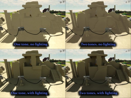
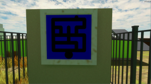
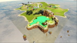
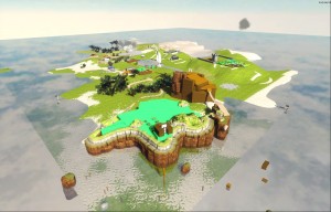
We've started experimenting with these blend shaders; here are some images:

The upper-left shows a scene before we implemented the blend shader for buildings. In the upper-right, we are using a blend shader that blends the original texture with an alternate one that is a bit darker and rougher (but the difference is a bit subtle, by game standards at least). Below these images are the same scenes with precomputed lighting mixed in.
It is pretty clear to me that the lighting is actually the biggest ingredient in tying the scene together, but the blend shader is, I think, a good extra kick. It helps the area feel like there is a little bit of life and history to it (for example, the lighter-colored paths near the puzzle panels in the foreground, which imply that people have been walking that way). What you see here is not of shipping quality, but I see how we can reach shipping quality by iterating on this style and putting production-level effort into the assets.
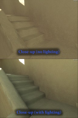
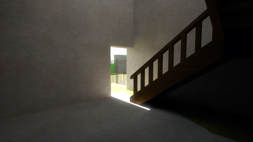
Here's a close-up of what the stairway looks like:

As you can see, the texture maps have some grain to them; from far away, the grain melts away and the structure is mostly a solid color, accented by lighting.
These experiments are still early yet but I find them very promising. The plan is that we will continue to hone the style and end up with something very special.


