A few new graphical effects.

Lately we started thinking about making the game look better, finally. Ignacio has been working on some graphical effects to this end (though he's been putting forth a lot of effort on performance as well). Here are a few things he's been working on:

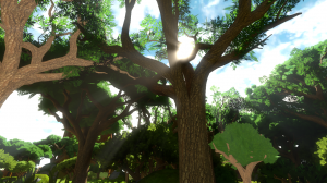
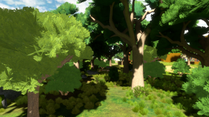
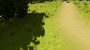
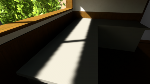
Sun beams. These are accomplished with a radial blur centered on the sun, during postprocessing. The nice thing about this effect is how dynamic it is -- as you walk beneath the trees, the shape and intensity of the beams are changing all the time.

Due to the way the effect works, sometimes beams are drawn that are a little bit unphysical. You probably have to be looking closely to see that, but I am a little bit uncomfortable with it given that the game is all about the opposite of that. We'll see how this evolves. We've been talking about augmenting this with other effects.

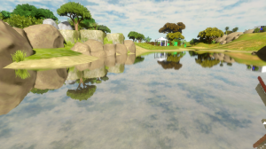
A revised water reflection effect.

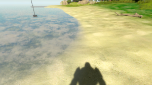
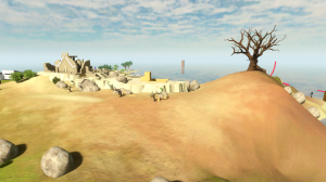
Softening of the shoreline, so that it doesn't look like one big alpha-blended water polygon intersecting the ground.

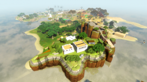
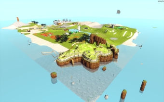
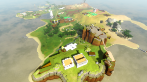
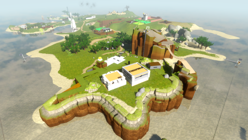
Here's what the island looks like now:

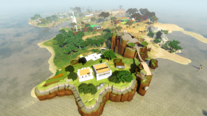
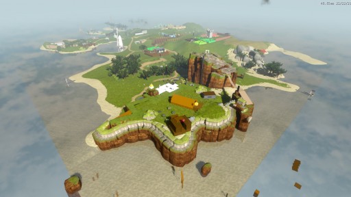
It's fun to look at this compared to another shot of the island, say, from about a year ago:

Island Snapshot

The current puzzle count is 328.

How to program independent games

On April 1, 2011, I was invited by UC Berkeley's Computer Science Undergraduate Association to come give a speech. This was pretty interesting because that's where I went to school, and I was once a member of the CSUA. I approached it this way: if I were going back to speak to my undergraduate self, what would I say to help him be most effective at making video games, programming-wise?

The talk's about 38 minutes long, with about 40 minutes of Q&A afterward. Here's a slideshow:

If the above embedded player doesn't work for you, or you prefer to download the files directly, here they are:

audio track
slides (ppt format)

Witness Trees

Hi, I'm Shannon and this in my first blog post about The Witness. I'm currently the only 3D artist working on the game and this post is about game trees... both the ones I'm making and game trees  in general.

I've worked on trees for games over the years, and I've come to a conclusion: There's no good way to make them currently. Trees reject the idea of low poly versions of themselves by their very nature, and what you're left with is many unsatisfactory ways of making them. It's up to the artist to pick which one of these techniques to use and to do their best to make it work. That choice depends on a lot of things. Does it have to be real-time, or can it be pre-rendered? Where will the player be when he sees the tree? Up close, far away, underneath, from above, or (in the worst case) all of these? Will there be a few trees or a forest of them? Then there's the engine constraints.  Overdraw, poly counts, texture space, LOD systems, lighting and light maps; all these affect how the trees need to be created. And none of that is even scratching the surface on the style you want the trees to have.

Still, I like a challenge as much as the next person.
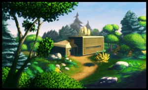
Here's an early visual mockup of the game that contains some trees. I didn't actually make this, but it did give me some direction is where to go. As you can see, the trees are very colorful and full of volume. I wasn't sure how close I could get to this, but I was going to give it a try. The problem with most low-poly game trees is that they are made with large sheets of polygons with branch and bough textures on them...and while this is certainly a way of making game trees, they usually can't be considered volumetric.

The current trees I have right now started from a lucky accident. Early on the engine couldn't handle alpha maps, so I want to make a bough structure that would look vaguely leafy without being too many polys and without using opacity maps. That's how I came up with this.
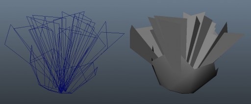

It's basically a ton of triangles sitting in a bowl. The bowl is there to simplify the bottom and hide the triangle nature of the triangles. It worked fine for the time I needed it. Recently I started adding a bunch of trees to the world and I wanted something fairly lightweight for even the large trees (the one I had done just before that was 40,000 polys, which was way too big). So I went to the old non-opacity tree, added some opacity maps and tried it out. And, surprisingly, it worked really well. It was giving me a volume I didn't expect, and it looked really good at a distance.
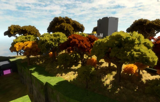
Not only that, I took a look at them with only the lightmaps on and the structure looked really nice...especially the branches underneath.
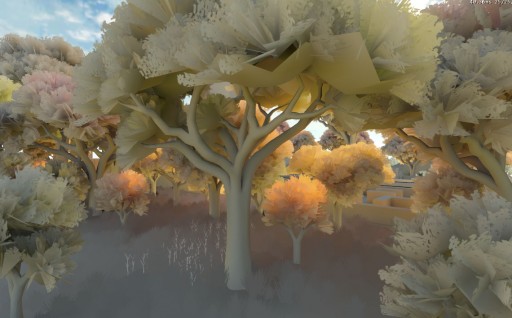
They were still too heavy though, being 12 thousand polys. Worse, they looked really bad up close and you could see that, what read as a nice, thick foliage from a distance, was really a mess of triangles.
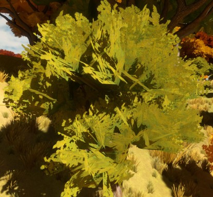
So the past few days I've been trying to make the trees look better from a close distance and be lower poly without losing what I liked about the previous ones. After a bit of struggle, I got something that seems to do the trick. Ignacio helped a lot, making a shader that made polys disappear when they became too edge on to the camera, which eliminated many ugly artifacts. The foliage is half the polys of the other trees, plus it looks a lot better close up. Here's a close shot of it, plus a comparison shot with an older tree.
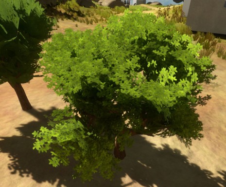
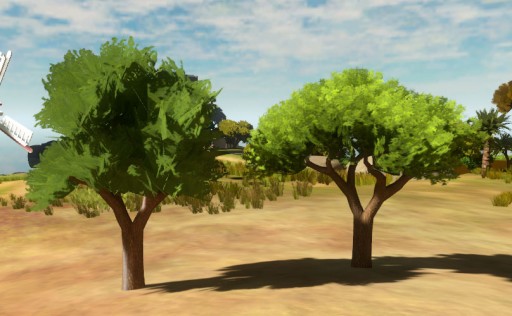
I still have a bunch of other ideas I want to add to these to make them look better, but I think we're on the right track to getting trees that really do have a nice amount of volume and harken back to the early mockups.

Thinking about color

We've known for a long time that we wanted some kind of color grading to happen in the postprocessing for The Witness; recently we started thinking about what that should be. Shannon wanted to try having colored shadows, as painters often do. We considered different ways of doing this; the "right way" to do it would involve keeping more data in offscreen buffers than we currently do, which could be expensive, but is definitely at least a hassle if you're just playing around with ideas. So instead, we decided to play around with the ambient light color: in shadow, the color of the ambient light is going to be a large influence on the perceived color of the surface, whereas outside of shadow, the color of the sun or light source will dominate, so it can be functionally pretty close to having colored shadows.

But we also figured, hey, why not play around with the color of sunlight as well? The idea is that as you walk around in the game, the color of the sun and ambient light will interpolate as you move. We haven't hooked it up that way yet; what you see below is just done by tweaking global variables in the game. Well be doing more experiments in this direction...


Themed areas

As mentioned in the previous couple of updates, we are starting to take steps toward establishing the visual style of the game. This past week while I was on vacation, Shannon did a bunch of world editing, with the primary goal being to draft out a few areas of the world that have different color schemes, as concepted in this post. Here's how the island looks with all the new trees, rocks, etc added:

Much denser and more visually interesting; it's starting to look like maybe a good game!

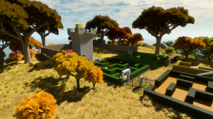
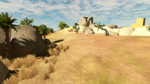
Here are some close-ups of different areas now.

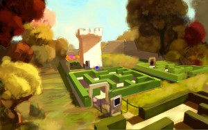
Autumnal:

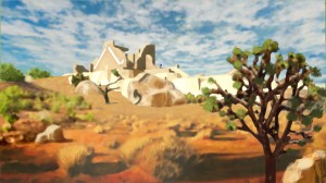
Desert:

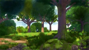
Foresty (there is a lightmapping problem on some of these trees so they are brighter than they should be!):

More island color experiments; shadow update

Until now, we had been using Uncharted-2-style blend mapping to color our terrain. This is a way of using a low-resolution texture map to control the blending of high-resolution textures; this gives you the ability to maintain fine pixel-by-pixel detail while also blending between multiple textures in order to create larger-scale patterns. (This method is in effect in earlier screenshots like this one, though keep in mind that we were not using it very seriously in a whole-island kind of way yet. For some idea of what the blend mapping looks like closer-in, see this or this.)

But now we are thinking about how to create colorful scenes, like in the previous post, and this style of blend-mapping did not seem like a very good idea. In order to create gradients across the scene, we would need to have a lot of blend layers; this would be slow and use a lot of texture memory (since now we are storing a lot of individual blend maps). Even once we did that, it would be laborious to control, and it's unclear that it would look good.

Ignacio mentioned that the Wolfire guys were just dropping one color map across their whole terrain. That seemed like a good idea to me -- I have done that before, but in contexts where we were trying to really crank up the resolution to levels that were ridiculous at the time, like 8192x8192 texture maps back in 2001. Rather than doing that, the idea now is to just use what is a reasonable-sized texture on a modern machine, and see what it looks like. So Shannon painted a 2048x2048 texture of the island (of which we are only really using less than half right now) and here's how it looks from up high:

Immediately this strikes me as much nicer, and much more in-tune with the art direction we want for the game. The buildings and other meshes now stick out like sore thumbs, but that is just what happens when you improve only a part of the scene. We'll be working on this.

Here's a scene from closer in:

As you can see, we have less detail close-up on the ground; things look a bit blurry. However, the colors are a lot better, and I think if we can adapt this scheme into something that permits sharper details up close, we will be able to make something that has a lot of character and looks special. In these shots, we are still using the old blend map system to tile high-detail normal maps across the terrain; that helps, but by itself it's not enough. (In recent videos for Overgrowth, like this one, you can see that they are doing something that provides close-up details, maybe just intensity maps that are being modulated by the color map). So we'll keep working on this and see how it goes.

Meanwhile, Ignacio has been revising the shadow map rendering. We used to have very speckly shadow maps, as I was using a 4-sample Poisson disc to sample the shadow map. Ignacio recently switched this to a Gaussian that has more taps, then applied some math tricks to reduce the number of taps. This results in softer shadows:

At some angles, shadow map jaggies still show up pretty clearly:

This is something we might work around in the final game by changing the scene when this happens! Or, it's possible the shadows will be modified further so that they look smoother in cases like this. Who can say?

Landscape color studies

Now that the gameplay is further along, we are starting to think more seriously about how the game is going to look. Shape and color are very important thematically; one idea that's been floating around for a while is that different locations on the island would have very different color palettes associated with them, and that this would help cement the locations' individual personalities. (This is not in principle a new idea; games often do this kind of thing, but I think the way we do it will make it special).

Shannon did a few color studies by taking screenshots of the game world as it stands today, then painting over them to build scenes with different palettes. Here's what he came up with:


I think it looks quite nice. Don't assume much based on the painterly style of these images; they were intentionally done at a low level of detail, so that we could quickly get a feel for the colors. We don't know yet exactly what the rendering style of the game will be in the end (but that is something we will start working on soon!)

Whew!

In a previous post I mentioned that we had done a bunch of playtesting at the GDC. As a result of that playtesting, I ended up heavily restructuring some areas of the game world. On top of that, there were a few areas that had been incomplete at that time, and I felt it was important to get those finished. So after the GDC I entered a period of very hard work to get all this stuff done, and it is now done! Here is how the island is looking now:

The puzzle count is now 285.

This means I am getting closer to my Gameplay Complete milestone. The bulk of the game design is now more-or-less there, in the sense that you can go and solve all the puzzles and they are basically the body of puzzles that will be there for the final game (though in the final game they will be refined, and more will be added -- but if we had to ship with only the puzzles that are in there now, we could do that, and it would be a good game). However, there's no endgame or winning condition, so I will be working on this next.

I think the endgame is going to be a bunch of work -- the original idea was ambitious, and I need to do a bunch of redesign on it since the game as a whole has evolved since the time the endgame was originally conceived. We'll see how it goes.

The visuals are still placeholder. In a couple of weeks we have some architects coming in to start designing buildings and terrain; at that time our production pipeline will change and we'll be moving a little closer to "the real visuals".

Braid playthrough with director’s commentary

At GameCity in Nottingham, UK in September 2010, I played through select portions of Braid and gave commentary. I had been under the impression the session was officially recorded, and I’ve been waiting for an official video to hit the internet, but at this point I am not sure this was done. Fortunately someone in the audience had a handheld camera, and has posted the footage to YouTube. This is by far the most I’ve said about Braid in one place…

See the video here.

Thanks to blog commenter justin for pointing this out!

GDC Playtesting; the island shrinks again…

This month was time for the annual Game Developers Conference in San Francisco [this has been its official name for a while now: the completely ungrammatical "Game Developers Conference". Whatever.] We used this opportunity to have game designer friends come and playtest The Witness. We did somewhere between 40 and 50 hours of playtesting that week, and it was all very useful. Thanks to everyone who came by and played!

As a result of these sessions it immediately became clear how to redesign some of the areas to improve pacing. So I started radically restructuring three of the major areas, as well as rearranging the relative positions of areas on the map. That process isn't done yet, but it is starting to converge (just one more area left to redesign). I am very happy with the two areas already redesigned; they are obviously far better than the original versions. It feels very rewarding when you feel good about a game already, and then do something to improve it so much.

Also, I've shrunk the island again. Here's what it looks like now:

The current puzzle count is 275.

Also, we are hiring.